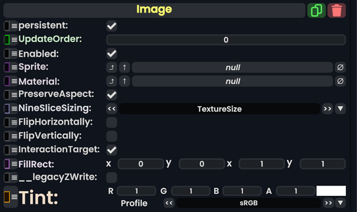
Filled in this component page. |
Added a video. |
||
| Line 31: | Line 31: | ||
<!--T:5--> | <!--T:5--> | ||
== Examples == | == Examples == | ||
Here is [[User:ProbablePrime|ProbablePrime]]'s tutorial on images: | |||
<youtube>FUUSjTwhvHk</youtube> | |||
<!--T:6--> | <!--T:6--> | ||
Revision as of 05:26, 22 July 2024
Component image 
Image component as seen in the Scene Inspector

The Image component takes in a SpriteProvider or Material and renders it onto the UIX. This can be used to display graphics and produce backgrounds.
| Name | Type | Description |
|---|---|---|
persistent
|
Bool | Determines whether or not this item will be saved to the server. |
UpdateOrder
|
Int | Controls the order in which this component is updated. |
Enabled
|
Bool | Controls whether or not this component is enabled. |
Sprite
|
Sprite | The sprite to render |
Material
|
Material | The material to render with |
PreserveAspect
|
Bool | Preserves the aspect ratio of this image provided. |
NineSliceSizing
|
NineSliceSizing | Tells how the image gets 9-sliced on this UIX. |
FlipHorizontally
|
Bool | Flips the image horizontally. |
FlipVertically
|
Bool | Flips the image vertically. |
InteractionTarget
|
Bool | Makes this image as the interaction target for this UIX. |
FillRect
|
Rect | The filling rect for this image. |
__legacyZWrite
|
Bool | Internal - The legacy Z writing for this image. |
Tint
|
ColorX | A color that is multiplied with the material's color. |
Usage
A user can use this to just display an image with an optional tint color, or have this as a background image for other images to be on top of.
Examples
Here is ProbablePrime's tutorial on images: