Component:ModalOverlay: Difference between revisions
From Resonite Wiki
More actions
Automated: update Fields, Categories |
Added a description and field descriptions. |
||
| Line 2: | Line 2: | ||
<translate> | <translate> | ||
<!--T:1--> | <!--T:1--> | ||
{{Infobox Component | {{Infobox Component | ||
|Image=ModalOverlayComponent.png | |Image=ModalOverlayComponent.png | ||
| Line 9: | Line 8: | ||
<!--T:2--> | <!--T:2--> | ||
The '''ModalOverlay''' component is a popup panel that a [[User|user]] can interact with. | |||
<!--T:3--> | <!--T:3--> | ||
{{Table ComponentFields | {{Table ComponentFields | ||
|ShowLerp|Float| | |ShowLerp|Float|The lerp amount for this modal. | ||
|AnimationTime|Float| | |AnimationTime|Float|The lerp time for this modal. | ||
|SizeRoot|'''[[Component:RectTransform|RectTransform]]'''|TypeAdv2=true| | |SizeRoot|'''[[Component:RectTransform|RectTransform]]'''|TypeAdv2=true|The size of this modal. | ||
|ContentRoot|'''[[Component:RectTransform|RectTransform]]'''|TypeAdv3=true| | |ContentRoot|'''[[Component:RectTransform|RectTransform]]'''|TypeAdv3=true|The center root of this modal. | ||
|CloseOnContextMenuAction|Bool| | |CloseOnContextMenuAction|Bool|Closes the modal when the user's context menu closes. | ||
|CloseOnClick|Bool| | |CloseOnClick|Bool|Closes this modal when it is clicked on. | ||
}} | }} | ||
<!--T:4--> | <!--T:4--> | ||
== | == Usage == | ||
<!--T:5--> | <!--T:5--> | ||
| Line 32: | Line 30: | ||
</translate> | </translate> | ||
[[Category:Components{{#translation:}}|Modal Overlay]] | [[Category:Components{{#translation:}}|Modal Overlay]] | ||
[[Category:Components:UIX:Interaction{{#translation:}}|Modal Overlay]] | [[Category:Components:UIX:Interaction{{#translation:}}|Modal Overlay]] | ||
Latest revision as of 10:16, 27 July 2024
Component image 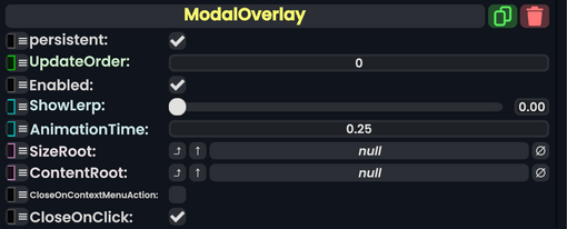
ModalOverlay component as seen in the Scene Inspector

The ModalOverlay component is a popup panel that a user can interact with.
| Name | Type | Description |
|---|---|---|
persistent
|
Bool | Determines whether or not this item will be saved to the server. |
UpdateOrder
|
Int | Controls the order in which this component is updated. |
Enabled
|
Bool | Controls whether or not this component is enabled. Some components stop their functionality when this field is disabled, but some don't. |
ShowLerp
|
Float | The lerp amount for this modal. |
AnimationTime
|
Float | The lerp time for this modal. |
SizeRoot
|
RectTransform | The size of this modal. |
ContentRoot
|
RectTransform | The center root of this modal. |
CloseOnContextMenuAction
|
Bool | Closes the modal when the user's context menu closes. |
CloseOnClick
|
Bool | Closes this modal when it is clicked on. |