The ContextMenuSubmenu component can be used in combination with any button component to make said button open a custom context menu when clicked. This is commonly done on avatars, using a [[RootContextMenuItem (Component)|RootContextMenuItem]] as the button, but can also be used on anything else.
The ContextMenuSubmenu component can be used in combination with any button component to make said button open a custom context menu when clicked.
<!--T:2-->
<!--T:2-->
== Fields ==
== Fields ==
{{Table ComponentFields
{{Table ComponentFields
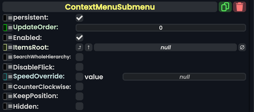
|ItemsRoot|Slot| All [[ContextMenuItemSource (Component)|ContextMenuItemSources]] on slots under this one will be included in the submenu.
|ItemsRoot|Slot| All [[Component:ContextMenuItemSource|Context Menu Item Sources]] on slots immediately under this one will be included in the submenu.
|SearchWholeHierarchy|Bool| {{stub}}
|SearchWholeHierarchy|Bool| Display all items under <code>ItemsRoot</slot> including sub slots, not just ones immediately under.
|DisableFlick|Bool| {{stub}}
|DisableFlick|Bool| Whether to allow opening of the sub menu by clicking on the context menu center and moving it to this component's [[Component:ContextMenuItemSource|Context Menu Item Source]] on the same slot.
|SpeedOverride|Nullable`1|TypeString3=Float?|
|SpeedOverride|'''[[Type:Nullable`1|Nullable`1]]<[[Type:Float|Float]]>'''|TypeAdv3=true| Override the speed at which the new context menu will open.
|CounterClockwise|Bool| Whether the items should be arranged clockwise or counter-clockwise in the submenu.
|CounterClockwise|Bool| Whether the items should be arranged clockwise or counter-clockwise in the submenu.
|KeepPosition|Bool| When set, the context menu will stay in the same place as the submenu opens. Otherwise, the context menu will recenter on the user's laser.
|KeepPosition|Bool| When set, the context menu will stay in the same place as the submenu opens. Otherwise, the context menu will recenter on the user's laser.
|Hidden|Bool| If set, the submenu is only visible to the user that opened it, (The button to open it)
|Hidden|Bool| If set, the submenu is only visible to the user that opened it.
}}
}}
<!--T:3-->
<!--T:3-->
== Usage ==
== Usage ==
{{stub}}
Attach this component to a [[Slot|slot]] and attach a [[Component:ContextMenuItemSource|Context Menu Item Source]] along side it. Providing a slot to
<!--T:4-->
<!--T:4-->
== Examples ==
== Examples ==
{{stub}}
This is commonly used on avatars, using a [[RootContextMenuItem (Component)|RootContextMenuItem]] as the button, but can also be used on anything else.
<!--T:5-->
<!--T:5-->
Line 32:
Line 31:
{{stub}}
{{stub}}
[[Category:ComponentStubs]]
[[Category:Components:Radiant UI:Context Menu{{#translation:}}|Context Menu Submenu]]
[[Category:Components|Context Menu Submenu]]
[[Category:Components{{#translation:}}|Context Menu Submenu]]
[[Category:Components:Radiant UI:Context Menu|Context Menu Submenu]]
Latest revision as of 17:36, 16 October 2024
Component image
Context Menu Submenu component as seen in the Scene Inspector
This article or section is a stub. You can help the Resonite wiki by expanding it.
The ContextMenuSubmenu component can be used in combination with any button component to make said button open a custom context menu when clicked.
Whether to allow opening of the sub menu by clicking on the context menu center and moving it to this component's Context Menu Item Source on the same slot.