This is no longer a stub. Style. Updated descriptions, added links.
(One intermediate revision by one other user not shown)
Line 2:
Line 2:
<translate>
<translate>
<!--T:1-->
<!--T:1-->
{{stub}}
{{Infobox Component
{{Infobox Component
|Image=ButtonToggleComponent.png
|Image=ButtonToggleComponent.png
Line 8:
Line 7:
}}
}}
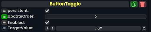
The ButtonValueToggle component can be used to make a button that switches a boolean value between true and false every time the button is pressed.
The '''ButtonValueToggle''' component can be used to make an [[Type:IButton|IButton]] that switches a [[Type:bool|boolean]] value between <code>true</code> and <code>false</code> every time the button is pressed.
<!--T:2-->
<!--T:2-->
== Fields ==
== Fields ==
{{Table ComponentFields
{{Table ComponentFields
|TargetValue|IField`1|TypeString0=IField<bool>| The boolean to invert whenever the button is pressed.
|TargetValue|'''[[Type:IField`1|IField`1]]<[[Type:Bool|Bool]]>'''|TypeAdv0=true| The [[Type:bool|boolean]] to invert whenever the button is pressed.
}}
}}
<!--T:3-->
<!--T:3-->
== Usage ==
== Usage ==
To function, the component simply needs to be attached to a slot that also has a button component attached to it. From then on, pressing that button will activate the ButtonToggle, making it toggle its <code>TargetValue</code> from true to false or the other way round.
To function, the component simply needs to be attached to a [[Slot|slot]] that also has a button component attached to it. From then on, pressing that button will activate the '''ButtonToggle''', making it toggle its <code>TargetValue</code> from true to false or the other way round.
The boolean to invert whenever the button is pressed.
Usage
To function, the component simply needs to be attached to a slot that also has a button component attached to it. From then on, pressing that button will activate the ButtonToggle, making it toggle its TargetValue from true to false or the other way round.