Component:CrossMesh: Difference between revisions
From Resonite Wiki
More actions
add info |
add picture |
||
| Line 27: | Line 27: | ||
Can be used to mark a point with a rotation like markers for debug testing. | Can be used to mark a point with a rotation like markers for debug testing. | ||
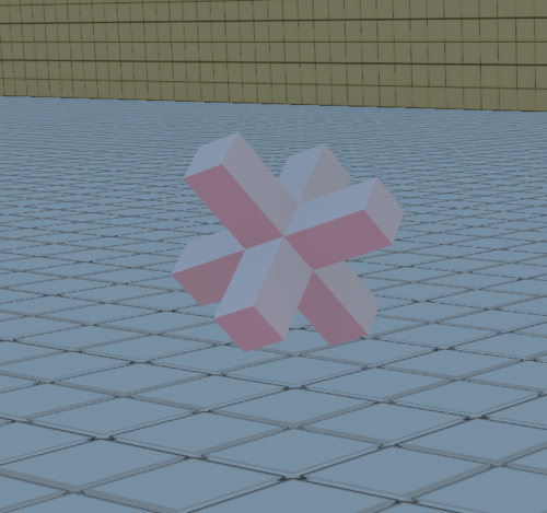
An example of what a default rotated cross mesh looks like | |||
[[File:CrossMesh.png|500px]] | |||
<!--T:5--> | <!--T:5--> | ||
Revision as of 22:16, 15 October 2024
Component image 
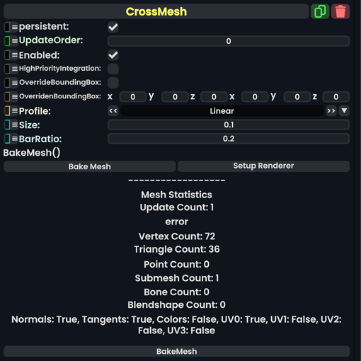
Cross Mesh component as seen in the Scene Inspector

A cross mesh is a 3D mesh made of 3 crossing boxes of equal thickness and length. It can be rotated, and the bars can be lengthened and thickened/thinned.
Fields
| Name | Type | Description |
|---|---|---|
persistent
|
Bool | Determines whether or not this item will be saved to the server. |
UpdateOrder
|
Int | Controls the order in which this component is updated. |
Enabled
|
Bool | Controls whether or not this component is enabled. Some components stop their functionality when this field is disabled, but some don't. |
HighPriorityIntegration
|
Bool | If true, integrating this asset (e.g. processing procedural assets) gets higher priority than assets with this flag off. An example is user laser procedural meshes. |
OverrideBoundingBox
|
Bool | Force the bounding box calculated from this component to use OverridenBoundingBox instead of calculating when requested.
|
OverridenBoundingBox
|
BoundingBox | the bounding box this component should say it has when OverrideBoundingBox is enabled. Useful for bounding box calculations with Flux, or changing the selection box for this component when rendered.
|
Profile
|
ColorProfile | The profile that the vertex colors for this mesh should be displayed in. |
Size
|
Float | The size of the cross from end to end in local space. |
BarRatio
|
Float | This multiplied by size is how thick each bar is in local space. |
Usage
Attach to a slot, and assign to a Mesh Renderer to see what it looks like. Don't forget to use a material.
Examples
Can be used to mark a point with a rotation like markers for debug testing.
An example of what a default rotated cross mesh looks like
