Component:LegacyCircleSegmentMesh: Difference between revisions
From Resonite Wiki
More actions
Automated: update 'BakeMesh()' description |
add info |
||
| Line 3: | Line 3: | ||
|Name=Legacy Circle Segment Mesh | |Name=Legacy Circle Segment Mesh | ||
}} | }} | ||
{{ | This is a Legacy item and should not be used. | ||
{{Quote|From a long dead platform. he who shall not be named on the holy land that is this wiki|[[User:989onan|989onan]]}} | |||
== | == Fields == | ||
{{Table ComponentFields | {{Table ComponentFields | ||
|HighPriorityIntegration|Bool|{{Asset HighPriorityIntegration Field}} | |HighPriorityIntegration|Bool|{{Asset HighPriorityIntegration Field}} | ||
|OverrideBoundingBox|Bool| | |OverrideBoundingBox|Bool| {{Template:Override Bounding Box}} | ||
|OverridenBoundingBox|BoundingBox| | |OverridenBoundingBox|BoundingBox| {{Template:Overridden Bounding Box}} | ||
|Profile|ColorProfile| | |Profile|ColorProfile| {{Template:ProceduralMeshColorProfile}} | ||
|ExpandLerp|Float| | |ExpandLerp|Float| How much to expand the mesh outwards | ||
|InnerCircle|Bool| | |InnerCircle|Bool| Whether this mesh has an inner circle. | ||
|RadiusStart|Float| | |RadiusStart|Float| The distance from the inner side of the segments to the center. | ||
|Thickness|Float| | |Thickness|Float| How thick the segments are from the circle center. | ||
|MainSegmentArc|Float| | |MainSegmentArc|Float| The main segment arc from the dead platform. | ||
|SeparationAngle|Float| | |SeparationAngle|Float| How far apart the segments should be. | ||
|MenuMainSegmentArc|Float| | |MenuMainSegmentArc|Float| How big the main segment should be. | ||
|CircleItemCount|Int| | |CircleItemCount|Int| how many segments there are. | ||
|MenuRadiusStart|Float| | |MenuRadiusStart|Float| Where the menu starts on a circle in degrees. | ||
|MenuThickness|Float| | |MenuThickness|Float| How thick the menu items are from circle center. | ||
|FillColor|ColorX| | |FillColor|ColorX| what color to fill the segments with. | ||
|OutlineColor|ColorX| | |OutlineColor|ColorX| What color the outline of the segments should be. | ||
|CircleItemOverrides|{{RootFieldType|SyncList`1|[[#MenuSegment|MenuSegment]]}}|TypeAdv16=true| | |CircleItemOverrides|{{RootFieldType|SyncList`1|[[#MenuSegment|MenuSegment]]}}|TypeAdv16=true| Custom list of segments to use. | ||
|IndependentSegments|{{RootFieldType|SyncList`1|[[#MenuSegment|MenuSegment]]}}|TypeAdv17=true| | |IndependentSegments|{{RootFieldType|SyncList`1|[[#MenuSegment|MenuSegment]]}}|TypeAdv17=true| Custom list of independent segments to use. | ||
|OutlineWidth|Float| | |OutlineWidth|Float| The width of the item outlines. | ||
}} | |||
== MenuSegement == | |||
{{Table TypeFields | |||
|RadiusStart|Float| The distance from the circle center before this segment's inner arc. | |||
|Thickness|Float| How thick this segment is from the circle center. | |||
|AngleStart|Float| Where this menu item starts in degrees on a circle. | |||
|ArcLength|Float| The amount of the circle in degrees this menu item takes up. | |||
|OverrideColor|Bool| Whether to override the root menu color with the one specified in here. | |||
|FillColor|ColorX| The fill color to use if overriding | |||
|OutlineColor|ColorX| The outline color to use if overriding. | |||
}} | }} | ||
| Line 33: | Line 46: | ||
}} | }} | ||
== | == Usage == | ||
Just don't. | |||
== Examples == | == Examples == | ||
{{stub}} | |||
== See Also == | == See Also == | ||
| Line 42: | Line 57: | ||
[[Category:Components{{#translation:}}|Legacy Circle Segment Mesh]] | [[Category:Components{{#translation:}}|Legacy Circle Segment Mesh]] | ||
[[Category:Components With Nested Types{{#translation:}}|Legacy Circle Segment Mesh]] | [[Category:Components With Nested Types{{#translation:}}|Legacy Circle Segment Mesh]] | ||
Revision as of 22:42, 22 January 2025
Component image 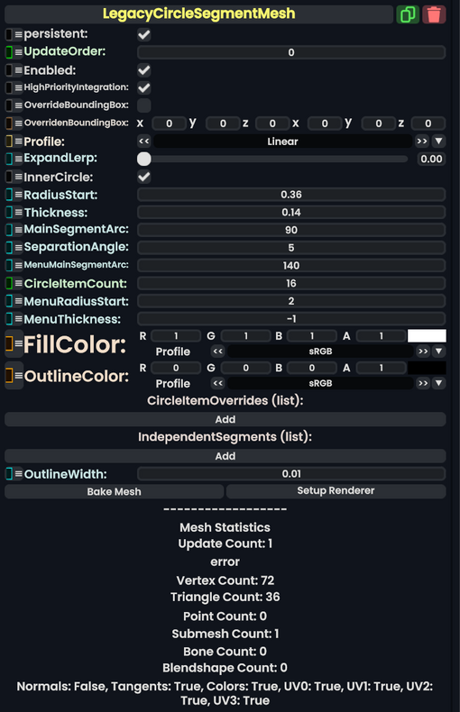
Legacy Circle Segment Mesh component as seen in the Scene Inspector

This is a Legacy item and should not be used.
From a long dead platform. he who shall not be named on the holy land that is this wiki
Fields
| Name | Type | Description |
|---|---|---|
persistent
|
Bool | Determines whether or not this item will be saved to the server. |
UpdateOrder
|
Int | Controls the order in which this component is updated. |
Enabled
|
Bool | Controls whether or not this component is enabled. Some components stop their functionality when this field is disabled, but some don't. |
HighPriorityIntegration
|
Bool | If true, integrating this asset (e.g. processing procedural assets) gets higher priority than assets with this flag off. An example is user laser procedural meshes. |
OverrideBoundingBox
|
Bool | Force the bounding box calculated from this component to use OverridenBoundingBox instead of calculating when requested.
|
OverridenBoundingBox
|
BoundingBox | the bounding box this component should say it has when OverrideBoundingBox is enabled. Useful for bounding box calculations with Flux, or changing the selection box for this component when rendered.
|
Profile
|
ColorProfile | The profile that the vertex colors for this mesh should be displayed in. |
ExpandLerp
|
Float | How much to expand the mesh outwards |
InnerCircle
|
Bool | Whether this mesh has an inner circle. |
RadiusStart
|
Float | The distance from the inner side of the segments to the center. |
Thickness
|
Float | How thick the segments are from the circle center. |
MainSegmentArc
|
Float | The main segment arc from the dead platform. |
SeparationAngle
|
Float | How far apart the segments should be. |
MenuMainSegmentArc
|
Float | How big the main segment should be. |
CircleItemCount
|
Int | how many segments there are. |
MenuRadiusStart
|
Float | Where the menu starts on a circle in degrees. |
MenuThickness
|
Float | How thick the menu items are from circle center. |
FillColor
|
ColorX | what color to fill the segments with. |
OutlineColor
|
ColorX | What color the outline of the segments should be. |
CircleItemOverrides
|
list of MenuSegment | Custom list of segments to use. |
IndependentSegments
|
list of MenuSegment | Custom list of independent segments to use. |
OutlineWidth
|
Float | The width of the item outlines. |
MenuSegement
| Name | Type | Description |
|---|---|---|
RadiusStart
|
Float | The distance from the circle center before this segment's inner arc. |
Thickness
|
Float | How thick this segment is from the circle center. |
AngleStart
|
Float | Where this menu item starts in degrees on a circle. |
ArcLength
|
Float | The amount of the circle in degrees this menu item takes up. |
OverrideColor
|
Bool | Whether to override the root menu color with the one specified in here. |
FillColor
|
ColorX | The fill color to use if overriding |
OutlineColor
|
ColorX | The outline color to use if overriding. |
Sync Delegates
| Method Name | Method type and Arguments. | Is the method hidden? | Description |
|---|
Usage
Just don't.
Examples
This article or section is a stub. You can help the Resonite wiki by expanding it.