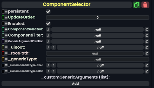
|ComponentSelected|{{RootFieldType|SyncDelegate`1|[[Type:ComponentSelectionHandler|ComponentSelectionHandler]]}}|TypeAdv0=true| The Sync delegate to call when the component is attached.
|ComponentFilter|{{RootFieldType|SyncDelegate`1|[[Type:Predicate`1|Predicate`1]]<[[Type:Type|Type]]>}}|TypeAdv1=true| The type of Components to show in the attacher.
|GenericArgumentPrefiller|{{RootFieldType|SyncDelegate`1|[[Type:GenericArgumentPrefiller|GenericArgumentPrefiller]]}}|TypeAdv2=true| A sync delegate that fills the list of generic arguments for a selected type so it doesn't only ask for a certain type.
|_uiRoot|Slot|
|_uiRoot|Slot| The root slot of the UI.
|_rootPath|String|
|_rootPath|String| The path that this is navigated to in the component attacher.
|_customGenericArguments|{{RootFieldType|SyncRefList`1|[[Component:TextField|TextField]]}}|TypeAdv8=true| The generic arguments being used for the current Component being attached. See [[Complex Types in Components]].
}}
== Sync Delegates ==
{{Table ComponentTriggers
|OnCancelPressed|[[Type:Delegate|Delegate]]<[[Type:IButton|IButton]] button, [[Type:ButtonEventData|ButtonEventData]] eventData>| Closes the UI and doesn't attach anything.
|OnOpenCategoryPressed|[[Type:Delegate|Delegate]]<[[Type:IButton|IButton]] button, [[Type:ButtonEventData|ButtonEventData]] eventData, [[Type:String|string]] path>| Opens a category of the path argument given.
|OnGenericTypesPressed|[[Type:Delegate|Delegate]]<[[Type:IButton|IButton]] button, [[Type:ButtonEventData|ButtonEventData]] eventData, [[Type:String|string]] pathType>| Builds the UI for a component being clicked that has a generic argument.
|OnGroupPressed|[[Type:Delegate|Delegate]]<[[Type:IButton|IButton]] button, [[Type:ButtonEventData|ButtonEventData]] eventData, [[Type:String|string]] pathWithGroup>| Builds a UI for a component group like Pack3 or Pack2.
|OnAddComponentPressed|[[Type:Delegate|Delegate]]<[[Type:IButton|IButton]] button, [[Type:ButtonEventData|ButtonEventData]] eventData, [[Type:String|string]] typename>| Triggers when a component is addrd.
|OnCreateCustomType|[[Type:Delegate|Delegate]]<[[Type:IButton|IButton]] button, [[Type:ButtonEventData|ButtonEventData]] eventData>| Triggers when a component is made via the attacher with a generic type that isn't in the list of preselected generics.