Introduction
LayoutElement is a component used within UIX, instructing components in slots above it in its hierarchy about how large it would like to be in a variety of dimensions and configurations within the UIX Layout flow. It is often used in combination with various other Layout components such as HorizontalLayout or VerticalLayout. By configuring its various properties, you can achieve a wide variety of effects and layouts.
Usage
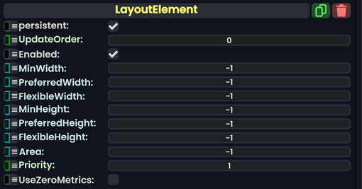
Many of these values may have unclear meaning, even with the table below. Please see the behavior section for more information.
| Name | Type | Description |
|---|---|---|
persistent
|
Bool | Determines whether or not this item will be saved to the server. |
UpdateOrder
|
Int | Controls the order in which this component is updated. |
Enabled
|
Bool | Controls whether or not this component is enabled. Some components stop their functionality when this field is disabled, but some don't. |
MinWidth
|
Float | The minimum width for this LayoutElement. |
PreferredWidth
|
Float | The preferred width for this LayoutElement. |
FlexibleWidth
|
Float | If there is any space left over after layouting, the width is used as a weight to decide what width should given to this LayoutElement. |
MinHeight
|
Float | The minimum height for this LayoutElement. |
PreferredHeight
|
Float | The preferred height for this LayoutElement. |
FlexibleHeight
|
Float | If there is any space left over after layouting, the height is used as a weight to decide what height should be given to this LayoutElement. |
Area
|
Float | Currently unused. |
Priority
|
Int | The priority for this LayoutElement. |
UseZeroMetrics
|
Bool | If checked, it allows "0" to be used in the other properties within this component. |
Behavior
LayoutElement is used to inform UIX Layout Components in the layout containers and slots above it within the hierarchy about what size it should be. This information is then used within the UIX Layout process with any other UIX Elements to determine an overall Layout.
For Width and Height there are 3 Properties which are used as a sort of negotiation with the UIX layout to determine the final size of an element. Other processes are involved but when it comes to just the layout element, the negotiation uses the following method:
- Ensure that the element is at least MinWidth/MinHeight in terms of units. If a layout element does not fit inside a parent container/RectTransform it will cause Overflow if these Minimums are too large.
- If there's enough space, give this element its PreferredWidth/PreferredHeight space in units. If there is not enough space for the "Preferred" value it will use a number that is between the "Min" value and the "Preferred" value.
- After both 1 and 2, if there is space available and the "Flexible" parameter is set it will give this element a weighted value of space by comparing the Flexible values of all other elements in the layout.
If a parameter should not be used, its value should be set to `-1`. You can also manually specify that it should be 0 by checking the "UseZeroMetrics" checkbox.
The priority parameter determines this layout's priority when compared with other elements within the same hierarchy. The highest priority wins. You usually do not need to touch this.
Examples
Vertical Layout & FlexibleHeight
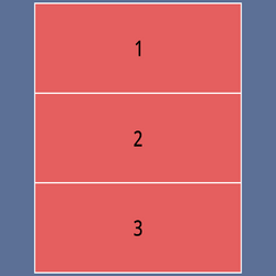
Pictured below is a VerticalLayout, with 3 LayoutElements beneath it. The slot hierarchy is as follows:
- VerticalLayout Slot
- Layout Element Slot 1
- Layout Element Slot 2
- Layout Element Slot 3
Each of the Layout Elements has its FlexibleHeight property set to 1, with all other properties set to their default values:
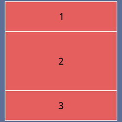
In this second picture, the middle element has its FlexibleHeight Property set to 2:
In this case, the VerticalLayout has awarded double the available height space to Layout Element Slot 2.

