Component:ModalOverlay
From Resonite Wiki
More actions
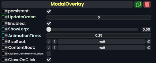
Component image 
ModalOverlay component as seen in the Scene Inspector

The ModalOverlay component is a popup panel that a user can interact with.
| Name | Type | Description |
|---|---|---|
persistent
|
Bool | Determines whether or not this item will be saved to the server. |
UpdateOrder
|
Int | Controls the order in which this component is updated. |
Enabled
|
Bool | Controls whether or not this component is enabled. Some components stop their functionality when this field is disabled, but some don't. |
ShowLerp
|
Float | The lerp amount for this modal. |
AnimationTime
|
Float | The lerp time for this modal. |
SizeRoot
|
RectTransform | The size of this modal. |
ContentRoot
|
RectTransform | The center root of this modal. |
CloseOnContextMenuAction
|
Bool | Closes the modal when the user's context menu closes. |
CloseOnClick
|
Bool | Closes this modal when it is clicked on. |