Component:GradientImage
You can make fancy effects and icons using this component, especially if your hue shifting the different color corners.
More actions
Component image 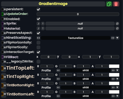
Gradient Image component as seen in the Scene Inspector

The GradiantImage component takes in a SpriteProvider or Material and controls the image color using the four corners of the image, then gradients them into the image.
| Name | Type | Description |
|---|---|---|
persistent
|
Bool | Determines whether or not this item will be saved to the server. |
UpdateOrder
|
Int | Controls the order in which this component is updated. |
Enabled
|
Bool | Controls whether or not this component is enabled. Some components stop their functionality when this field is disabled, but some don't. |
Sprite
|
Sprite | The sprite to use as the image. |
Material
|
Material | The Material to use as the image. |
PreserveAspect
|
Bool | Preserves the aspect ratio of this image provided. |
NineSliceSizing
|
NineSliceSizing | Tells how the image gets 9-sliced on this UIX. |
FlipHorizontally
|
Bool | Flips the image horizontally (but not the color). |
FlipVertically
|
Bool | Flips the image vertically (but not the color). |
InteractionTarget
|
Bool | Makes this image as the interaction target for this UIX. |
FillRect
|
Rect | The filling rect for this image. |
__legacyZWrite
|
Bool | The legacy Z writing for this image. |
TintTopLeft
|
ColorX | The color of this top left corner. |
TintTopRight
|
ColorX | The color of this top right corner. |
TintBottomRight
|
ColorX | The color of this bottom right corner. |
TintBottomLeft
|
ColorX | The color of this bottom left corner. |
Usage
You can make fancy effects and icons using this component, especially if your hue shifting the different color corners.