Your IP address will be publicly visible if you make any edits.
Component:LegacyUIStyle
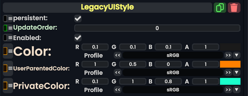
The LegacyUIStyle component is used in older content to specify what colors a UI should be depending on where it is. This should not be used in new content, and should be removed/replaced whenever possible.
More actions
This article describes a feature marked as legacy—this usually means there's a newer, better alternative. Legacy features might not be removed but they will not be updated, and the team will not provide any support for them.
The LegacyUIStyle component is used in older content to specify what colors a UI should be depending on where it is. This should not be used in new content, and should be removed/replaced whenever possible.