Component:OverlappingLayout
The OverlappingLayout is best explained on the UIX page. The description for such is as follows:
More actions
Component image 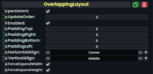
Overlapping Layout component as seen in the Scene Inspector

The OverlappingLayout is best explained on the UIX page. The description for such is as follows:
A [Overlapping layout] layout overlaps or places on top of another layout in the same space.
Fields
| Name | Type | Description |
|---|---|---|
persistent
|
Bool | Determines whether or not this item will be saved to the server. |
UpdateOrder
|
Int | Controls the order in which this component is updated. |
Enabled
|
Bool | Controls whether or not this component is enabled. Some components stop their functionality when this field is disabled, but some don't. |
PaddingTop
|
Float | The padding from the center content to the top side. |
PaddingRight
|
Float | The padding from the center content to the right side. |
PaddingBottom
|
Float | The padding from the center content to the bottom side. |
PaddingLeft
|
Float | The padding from the center content to the left side. |
HorizontalAlign
|
LayoutHorizontalAlignment | The alignment of the content horizontally. |
VerticalAlign
|
LayoutVerticalAlignment | The alignment of the content vertically. |
ForceExpandWidth
|
Bool | Whether content inside this layout going beyond the normal container size of this layout should be forced to go beyond the container so it fits width wise. |
ForceExpandHeight
|
Bool | Whether content inside this layout going beyond the normal container size of this layout should be forced to go beyond the container so it fits height wise. |
Usage
See UIX.
Examples
The default UI elements from Resonite like the slider and buttons.