Component image 
Text Expand Indicator component as seen in the Scene Inspector

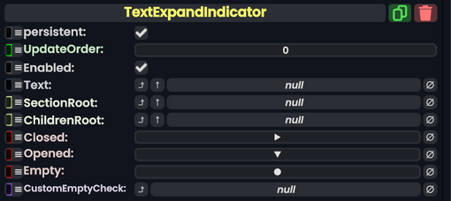
The TextExpandIndicator component is used in inspectors to show whether or not a section like slots under another slot is expanded out and/or has any children items.
Name | Type | Description |
---|---|---|
persistent
|
Bool | Determines whether or not this item will be saved to the server. |
UpdateOrder
|
Int | Controls the order in which this component is updated. |
Enabled
|
Bool | Controls whether or not this component is enabled. Some components stop their functionality when this field is disabled, but some don't. |
Text
|
field drive of String | The text to drive with the dropdown indication. |
SectionRoot
|
Slot | The slot where children items for a slot is placed for the UI visual. |
ChildrenRoot
|
Slot | The slot to check for children slots to tell if it has children or not. |
Closed
|
String | The string to display when the section is closed. |
Opened
|
String | The string to display when the section is opened. |
Empty
|
String | The string to display when ChildrenRoot is empty.
|
CustomEmptyCheck
|
delegate of identity Func`1<Bool> | A custom check sync delegate to use to check if the target is empty. |
Usage
This component is combined with the Expander component to show the user that the expander has expanded, collapsed, or is empty using symbols.