m ProbablePrime moved page ProgressBar (Component) to Component:ProgressBar: Creating component Namespace |
Updated descriptions, added a video. |
||
| (One intermediate revision by one other user not shown) | |||
| Line 2: | Line 2: | ||
<translate> | <translate> | ||
<!--T:1--> | <!--T:1--> | ||
{{Infobox Component | {{Infobox Component | ||
|Image=ProgressBarComponent.png | |Image=ProgressBarComponent.png | ||
| Line 9: | Line 8: | ||
<!--T:2--> | <!--T:2--> | ||
The '''ProgressBar''' component is used to show the [[User|user]] the normalized input of a float value on the [[UIX]] element. | |||
<!--T:3--> | <!--T:3--> | ||
{{Table ComponentFields | {{Table ComponentFields | ||
|Progress|Float| The normalized progression the of value | |Progress|Float| The normalized progression the of value | ||
|AnchorMinOffset|Float2| [[UIX]] Anchor minimum offset | |AnchorMinOffset|Float2| [[UIX]] Anchor minimum offset | ||
|AnchorMaxOffset|Float2| [[UIX]] Anchor maximum offset | |AnchorMaxOffset|Float2| [[UIX]] Anchor maximum offset | ||
|AnchorMin|Float2| [[UIX]] Anchor minimum offset reference input | |AnchorMin|{{RootFieldType|FieldDrive`1|[[Type:Float2|Float2]]}}|TypeAdv3=true| [[UIX]] Anchor minimum offset reference input | ||
|AnchorMax|Float2| [[UIX]] Anchor maximum offset reference input | |AnchorMax|{{RootFieldType|FieldDrive`1|[[Type:Float2|Float2]]}}|TypeAdv4=true| [[UIX]] Anchor maximum offset reference input | ||
|Power|Float| Modifies the Power of the progress bar | |Power|Float| Modifies the Power of the progress bar | ||
}} | }} | ||
<!--T:4--> | <!--T:4--> | ||
== | == Usage == | ||
<!--T:5--> | <!--T:5--> | ||
| Line 32: | Line 28: | ||
An example of how the Power field works.<br clear="all/> | An example of how the Power field works.<br clear="all/> | ||
[[File:ProgressBarComponentPower.gif|500px|An example of how the Power field works]]<br clear="all/> | [[File:ProgressBarComponentPower.gif|500px|An example of how the Power field works]]<br clear="all/> | ||
=== Videos === | |||
<youtube>wwvyTqjC5Q0</youtube> | |||
== Related Components == | == Related Components == | ||
</translate> | </translate> | ||
[[Category:Components{{#translation:}}| | [[Category:Components{{#translation:}}|Progress Bar]] | ||
[[Category:Components:UIX:Interaction{{#translation:}}|Progress Bar]] | |||
[[Category:Components:UIX:Interaction{{#translation:}}| | |||
Latest revision as of 10:43, 27 July 2024
Component image 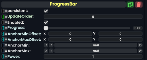
ProgressBar component as seen in the Scene Inspector

The ProgressBar component is used to show the user the normalized input of a float value on the UIX element.
| Name | Type | Description |
|---|---|---|
persistent
|
Bool | Determines whether or not this item will be saved to the server. |
UpdateOrder
|
Int | Controls the order in which this component is updated. |
Enabled
|
Bool | Controls whether or not this component is enabled. Some components stop their functionality when this field is disabled, but some don't. |
Progress
|
Float | The normalized progression the of value |
AnchorMinOffset
|
Float2 | UIX Anchor minimum offset |
AnchorMaxOffset
|
Float2 | UIX Anchor maximum offset |
AnchorMin
|
field drive of Float2 | UIX Anchor minimum offset reference input |
AnchorMax
|
field drive of Float2 | UIX Anchor maximum offset reference input |
Power
|
Float | Modifies the Power of the progress bar |
Usage
Examples
Power
An example of how the Power field works.
