Small overhaul. Updated description. Added usage information.
(2 intermediate revisions by 2 users not shown)
Line 2:
Line 2:
<translate>
<translate>
<!--T:1-->
<!--T:1-->
{{stub}}
{{Infobox Component
{{Infobox Component
|Image=ValueRadio`1Component.png
|Image=ValueRadio`1Component.png
Line 9:
Line 8:
<!--T:2-->
<!--T:2-->
== Intoduction ==
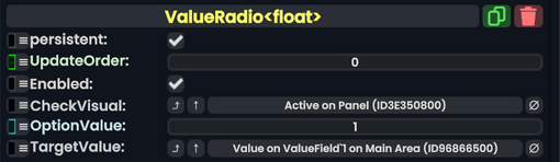
The '''ValueRadio''' component is a listener component that activates or deactivates slots using the <code>CheckVisual</code> field, based if a <code>TargetValue</code> matches the <code>OptionValue</code> field. When a match is found, the <code>CheckVisual</code> field will be set to true.
ValueRadio components can be used to create a radio selector, meaning a set of buttons that are used to set the same value to different options.
<!--T:3-->
<!--T:3-->
== Fields ==
== Fields ==
{{Table ComponentFields
{{Table ComponentFields
|CheckVisual|Bool| The boolean that is driven to true whenever the <code>TargetValue</code> is equal to the <code>OptionValue</code>
|CheckVisual|{{RootFieldType|FieldDrive`1|[[Type:Bool|Bool]]}}|TypeAdv0=true| The boolean that is driven to true whenever the <code>TargetValue</code> is equal to the <code>OptionValue</code>
|OptionValue|T| What to set the <code>TargetValue</code> to when the button is pressed.
|OptionValue|'''T'''|TypeAdv1=true| What to set the <code>TargetValue</code> to when the button is pressed.
|TargetValue|IField`1|TypeString2=IField<T>| The value to set when the button is pressed.
|TargetValue|{{RootFieldType|RelayRef`1|[[Type:IField`1|IField`1]]<T>}}|TypeAdv2=true| The value to set when the button is pressed.
}}
}}
Line 23:
Line 21:
== Usage ==
== Usage ==
To function, the component simply needs to be attached to a slot that also has a button component attached to it. From then on, pressing that button will activate the ValueRadio, making it set its <code>TargetValue</code> to its <code>OptionValue</code>, which then also sets its <code>CheckVisual</code> to true.
To function, the component simply needs to be attached to a slot that also has a button component attached to it. From then on, pressing that button will activate the ValueRadio, making it set its <code>TargetValue</code> to its <code>OptionValue</code>, which then also sets its <code>CheckVisual</code> to true.
* This is useful for making forms that need one answer from many choices, a set of button that should only have one being active, and anything that requires only one activation from many things.
* the <code>CheckVisual</code> field does not just have to be the active of a slot, this can be any [[Type:IField|IField]] [[Type:bool|bool]], allowing users to be creative with how they want to structure their component's logic.
<!--T:5-->
<!--T:5-->
Line 29:
Line 30:
<!--T:6-->
<!--T:6-->
== Related Issues ==
== Related Issues ==
[https://github.com/Neos-Metaverse/NeosPublic/issues/1855 <s>#1855 - Creating reference typed variants of several value type-only components causes crashes</s>]
The ValueRadio component is a listener component that activates or deactivates slots using the CheckVisual field, based if a TargetValue matches the OptionValue field. When a match is found, the CheckVisual field will be set to true.
To function, the component simply needs to be attached to a slot that also has a button component attached to it. From then on, pressing that button will activate the ValueRadio, making it set its TargetValue to its OptionValue, which then also sets its CheckVisual to true.
This is useful for making forms that need one answer from many choices, a set of button that should only have one being active, and anything that requires only one activation from many things.
the CheckVisual field does not just have to be the active of a slot, this can be any IFieldbool, allowing users to be creative with how they want to structure their component's logic.