Component:Text: Difference between revisions

From Resonite Wiki
Automated: update Fields, Categories
Added a video.
 
(2 intermediate revisions by 2 users not shown)
Line 2: Line 2:
<translate>
<translate>
<!--T:1-->
<!--T:1-->
{{stub}}
{{Infobox Component
{{Infobox Component
|Image=TextComponent.png
|Image=TextComponent.png
Line 9: Line 8:


<!--T:2-->
<!--T:2-->
== Introduction ==
The '''Text''' component displays text inside of a [[UIX]] element. It also supports [[Text Formatting|text formatting]].
 
This component displays text inside of a UIX canvas. It also supports [[Text Formatting|text formatting]].


<!--T:3-->
<!--T:3-->
== Usage ==
{{Table ComponentFields
|Font|{{RootFieldType|AssetRef`1|[[Type:FontSet|FontSet]]}}|TypeAdv0=true|The font to use
|Font|{{RootFieldType|AssetRef`1|[[Type:FontSet|FontSet]]}}|TypeAdv0=true|The font to use
|Content|String|What to display
|Content|String|What [[Type:string|string]] of text to display
|ParseRichText|Bool|Whether or not to interpret [[Text Formatting|text formatting]]
|ParseRichText|Bool|Whether or not to interpret [[Text Formatting|text formatting]]
|NullContent|String|What to display if Content is empty
|NullContent|String|What to display if Content is empty
Line 27: Line 23:
|Materials|{{RootFieldType|SyncAssetList`1|[[Type:Material|Material]]}}|TypeAdv9=true|The Material(s) to render with
|Materials|{{RootFieldType|SyncAssetList`1|[[Type:Material|Material]]}}|TypeAdv9=true|The Material(s) to render with
|LineHeight|Float|How high each line of text is
|LineHeight|Float|How high each line of text is
|MaskPattern|String|TBD
|MaskPattern|String|Text entered here will mask each character with this exact string (example for a password field: *)
|HorizontalAutoSize|Bool|Automatically adjusts the text's size to fit in its horizontal space
|HorizontalAutoSize|Bool|Automatically adjusts the text's size to fit in its horizontal space
|VerticalAutoSize|Bool|Automatically adjusts the text's size to fit in its vertical space
|VerticalAutoSize|Bool|Automatically adjusts the text's size to fit in its vertical space
|AutoSizeMin|Float|The minimum size that can be reached via auto-sizing
|AutoSizeMin|Float|The minimum size that can be reached via auto-sizing
|AutoSizeMax|Float|The maximum size that can be reached via auto-sizing
|AutoSizeMax|Float|The maximum size that can be reached via auto-sizing
|CaretPosition|Int|TBD
|CaretPosition|Int|The text cursor position on this text
|SelectionStart|Int|TBD
|SelectionStart|Int|The starting point for this text cursor
|CaretColor|ColorX|TBD
|CaretColor|ColorX|The text cursor color
|SelectionColor|ColorX|TBD
|SelectionColor|ColorX|The text selection/highlight color
|InteractionTarget|Bool|TBD
|InteractionTarget|Bool|Makes this text as the interaction target for this UIX.
|_legacyFontMaterial|'''[[Component:FontMaterial|FontMaterial]]'''|TypeAdv21=true|Internal
|_legacyFontMaterial|'''[[Component:FontMaterial|FontMaterial]]'''|TypeAdv21=true|Internal
|_legacyAlign|Alignment|Internal
|_legacyAlign|Alignment|Internal
}}
}}
== Usage ==
Text can be used to explain something, to be descriptive, to notify, and many other things text can be used for. When being effective with text, basic graphic design principles apply even to something simple as text.


<!--T:4-->
<!--T:4-->
== Examples ==
== Examples ==


Here we start with a parent that has a [[VerticalLayout (Component)|VerticalLayout]] component with ForceExpandWidth and ForceExpandHeight set.
Within the Resonite's Essential, there is an UI preset called the "Panel base". This UI preset uses the text component to display texts within the panel.
 
[[File:Text layout example vertical layout parent.jpeg|800px]]
 
The first child contains text, with no [[LayoutElement (Component)|LayoutElement]].
 
[[File:Text layout example text child.jpeg|800px]]
 
The second child is an [[Image (Component)|Image]] with a [[LayoutElement (Component)|LayoutElement]] set to its defaults.


[[File:20210515151449 1.jpg|800px]]
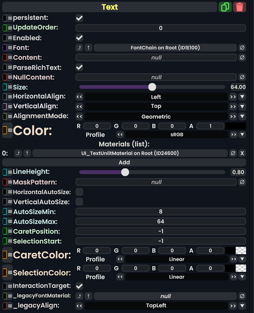
[[File:Text component.jpg|800px]]


As we see, rather than having equally-weighted children, the image child is squashed. In part this is because the image child has no preferred height, but also the text seems to have a preferred height that includes some empty space underneath it.
=== Videos ===


Setting various values in the LayoutElement of the image child does expand that child. For example, setting its FlexibleHeight to 1 or its PreferredHeight to 100.
Here is [[User:ProbablePrime|ProbablePrime]]'s tutorial on Text:
<youtube>lCGfFJYOj3o</youtube>


<!--T:6-->
<!--T:6-->
Line 64: Line 56:
</translate>
</translate>
[[Category:Components{{#translation:}}|Text]]
[[Category:Components{{#translation:}}|Text]]
[[Category:ComponentStubs]]
[[Category:Components:UIX:Graphics{{#translation:}}|Text]]
[[Category:Components:UIX:Graphics{{#translation:}}|Text]]

Latest revision as of 05:18, 22 July 2024

Component image 
Text component as seen in the Scene Inspector


The Text component displays text inside of a UIX element. It also supports text formatting.

Fields
Name Type Description
persistent Bool Determines whether or not this item will be saved to the server.
UpdateOrder Int Controls the order in which this component is updated.
Enabled Bool Controls whether or not this component is enabled.
Font FontSet The font to use
Content String What string of text to display
ParseRichText Bool Whether or not to interpret text formatting
NullContent String What to display if Content is empty
Size Float The size to render text at, in display units
HorizontalAlign TextHorizontalAlignment How to align the text, horizontally
VerticalAlign TextVerticalAlignment How to align the text, vertically
AlignmentMode AlignmentMode How to compute alignment
Color ColorX The color to render the text with
Materials list of Material The Material(s) to render with
LineHeight Float How high each line of text is
MaskPattern String Text entered here will mask each character with this exact string (example for a password field: *)
HorizontalAutoSize Bool Automatically adjusts the text's size to fit in its horizontal space
VerticalAutoSize Bool Automatically adjusts the text's size to fit in its vertical space
AutoSizeMin Float The minimum size that can be reached via auto-sizing
AutoSizeMax Float The maximum size that can be reached via auto-sizing
CaretPosition Int The text cursor position on this text
SelectionStart Int The starting point for this text cursor
CaretColor ColorX The text cursor color
SelectionColor ColorX The text selection/highlight color
InteractionTarget Bool Makes this text as the interaction target for this UIX.
_legacyFontMaterial FontMaterial Internal
_legacyAlign Alignment Internal

Usage

Text can be used to explain something, to be descriptive, to notify, and many other things text can be used for. When being effective with text, basic graphic design principles apply even to something simple as text.

Examples

Within the Resonite's Essential, there is an UI preset called the "Panel base". This UI preset uses the text component to display texts within the panel.

Videos

Here is ProbablePrime's tutorial on Text:

Related Components