Component:LegacyUIStyle: Difference between revisions

From Resonite Wiki
Automated: create new component page
 
userspace
 
(2 intermediate revisions by 2 users not shown)
Line 1: Line 1:
{{Legacy}}
{{Infobox Component
{{Infobox Component
|Image=LegacyUIStyleComponent.png
|Image=LegacyUIStyleComponent.png
|Name=Legacy UIStyle
|Name=LegacyUIStyle
}}
}}
{{stub}}


== Usage ==
The '''LegacyUIStyle''' component is used in older content to specify what colors a UI should be depending on where it is. This should not be used in new content, and should be removed/replaced whenever possible.
 
== Fields ==
{{Table ComponentFields
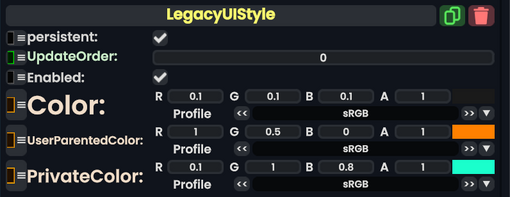
|Color|ColorX|
|Color|ColorX| The normal color.
|UserParentedColor|ColorX|
|UserParentedColor|ColorX| The color a UI should have when parented under the user.
|PrivateColor|ColorX|
|PrivateColor|ColorX| The color a UI should have when it's in [[userspace]].
}}
}}


== Behavior ==


== Examples ==
== Examples ==
Used to specify to Legacy UI what color it should use.


== See Also ==
== See Also ==
Line 20: Line 23:
[[Category:Components:Rendering:Visuals{{#translation:}}|Legacy UIStyle]]
[[Category:Components:Rendering:Visuals{{#translation:}}|Legacy UIStyle]]
[[Category:Components{{#translation:}}|Legacy UIStyle]]
[[Category:Components{{#translation:}}|Legacy UIStyle]]
[[Category:ComponentStubs]]

Latest revision as of 18:37, 14 April 2025

This article describes a feature marked as legacy—this usually means there's a newer, better alternative. Legacy features might not be removed but they will not be updated, and the team will not provide any support for them.
Component image 
LegacyUIStyle component as seen in the Scene Inspector


The LegacyUIStyle component is used in older content to specify what colors a UI should be depending on where it is. This should not be used in new content, and should be removed/replaced whenever possible.

Fields

Fields
Name Type Description
persistent Bool Determines whether or not this item will be saved to the server.
UpdateOrder Int Controls the order in which this component is updated.
Enabled Bool Controls whether or not this component is enabled. Some components stop their functionality when this field is disabled, but some don't.
Color ColorX The normal color.
UserParentedColor ColorX The color a UI should have when parented under the user.
PrivateColor ColorX The color a UI should have when it's in userspace.


Examples

Used to specify to Legacy UI what color it should use.

See Also