(One intermediate revision by one other user not shown)
Line 1:
Line 1:
{{Legacy}}
{{Infobox Component
{{Infobox Component
|Image=LegacyUIStyleComponent.png
|Image=LegacyUIStyleComponent.png
|Name=Legacy UIStyle
|Name=LegacyUIStyle
}}
}}
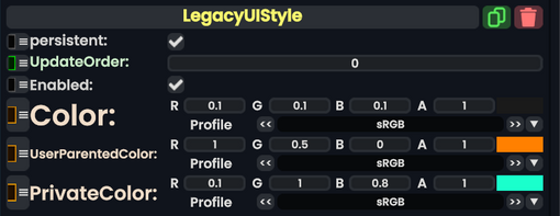
The '''LegacyUIStyle''' component is used in old legacy content to specify what colors a UI should be depending on where it is. This should not be used in new content, and should be removed/replaced whenever possible.
The '''LegacyUIStyle''' component is used in older content to specify what colors a UI should be depending on where it is. This should not be used in new content, and should be removed/replaced whenever possible.
== Fields ==
== Fields ==
Line 9:
Line 11:
|Color|ColorX| The normal color.
|Color|ColorX| The normal color.
|UserParentedColor|ColorX| The color a UI should have when parented under the user.
|UserParentedColor|ColorX| The color a UI should have when parented under the user.
|PrivateColor|ColorX| The color a UI should have when it's in the dash world.
|PrivateColor|ColorX| The color a UI should have when it's in [[userspace]].
}}
}}
== Usage ==
Just dont.
== Examples ==
== Examples ==
Used to specify to Legacy UI what color it should use.
Used to specify to Legacy UI what color it should use.
Latest revision as of 18:37, 14 April 2025
This article describes a feature marked as legacy—this usually means there's a newer, better alternative. Legacy features might not be removed but they will not be updated, and the team will not provide any support for them.
The LegacyUIStyle component is used in older content to specify what colors a UI should be depending on where it is. This should not be used in new content, and should be removed/replaced whenever possible.