Automated: update Categories |
This page is no longer a stub. Basic cleanup. |
||
| Line 2: | Line 2: | ||
<translate> | <translate> | ||
<!--T:1--> | <!--T:1--> | ||
{{Infobox Component | {{Infobox Component | ||
|Image=ContentSizeFitterComponent.png | |Image=ContentSizeFitterComponent.png | ||
| Line 9: | Line 8: | ||
<!--T:2--> | <!--T:2--> | ||
The '''ContentSizeFitter''' resizes the slots's [[RectTransform (Component)|RectTransform]] to fit the minimum or preferred size of its other ''layout'' components in width or height. In effect, it kind of shrink-wraps its contents. | The '''ContentSizeFitter''' resizes the slots's [[RectTransform (Component)|RectTransform]] to fit the minimum or preferred size of its other ''layout'' components in width or height. In effect, it kind of shrink-wraps its contents. | ||
| Line 16: | Line 13: | ||
<!--T:3--> | <!--T:3--> | ||
{{Table ComponentFields | {{Table ComponentFields | ||
|HorizontalFit|SizeFit|The fit mode to use to determine the width. | |HorizontalFit|SizeFit|The fit mode to use to determine the width. | ||
| Line 28: | Line 24: | ||
<!--T:4--> | <!--T:4--> | ||
== Usage == | |||
This is used for a polished look of keeping your contents in the bounds of a [[UIX]] element. | |||
== Behavior == | == Behavior == | ||
| Line 51: | Line 50: | ||
</translate> | </translate> | ||
[[Category:Components{{#translation:}}|Content Size Fitter]] | [[Category:Components{{#translation:}}|Content Size Fitter]] | ||
[[Category:Components:UIX:Layout{{#translation:}}|Content Size Fitter]] | [[Category:Components:UIX:Layout{{#translation:}}|Content Size Fitter]] | ||
Revision as of 22:25, 28 July 2024

The ContentSizeFitter resizes the slots's RectTransform to fit the minimum or preferred size of its other layout components in width or height. In effect, it kind of shrink-wraps its contents.
Note that this does not include its children slots, and only works on slots that have a layout component. For working with children, the parent with the ContentSizeFitter needs to also have a HorizontalLayout, VerticalLayout, or GridLayout component. LayoutElement is also a layout component, as is Text and Image.
| Name | Type | Description |
|---|---|---|
persistent
|
Bool | Determines whether or not this item will be saved to the server. |
UpdateOrder
|
Int | Controls the order in which this component is updated. |
Enabled
|
Bool | Controls whether or not this component is enabled. Some components stop their functionality when this field is disabled, but some don't. |
HorizontalFit
|
SizeFit | The fit mode to use to determine the width. |
VerticalFit
|
SizeFit | The fit mode to use to determine the height. |
Fit modes are:
- Disabled: Don't perform any resizing.
- MinSize: Resize to the minimum size of the content.
- PreferredSize: Resize to the preferred size of the content.
Usage
This is used for a polished look of keeping your contents in the bounds of a UIX element.
Behavior
The ContentSizeFitter functions as a layout controller that controls the size of its own layout component. The size is determined by the minimum or preferred sizes provided by layout components its own slot. Such layout components can be Image or Text components, VerticalLayout, HorizontalLayout, or a LayoutElement component.
Examples
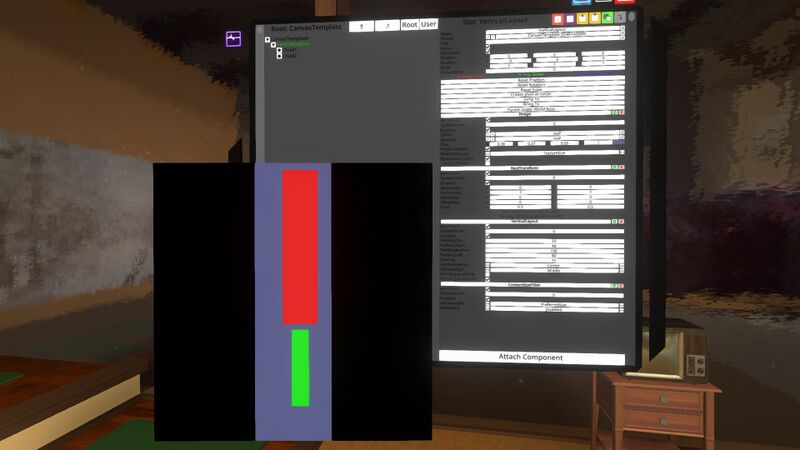
In this example, we'll "shrink-wrap" the example from the VerticalLayout page. We do this by adding a ContentSizeFitter to the slot with the VerticalLayout, and setting its HorizontalFit mode to PreferredSize. Since the preferred width of the vertical layout is simply the maximum of its children's preferred widths plus the left and right spacing, the vertical layout shrinks horizontally to equal that preference:
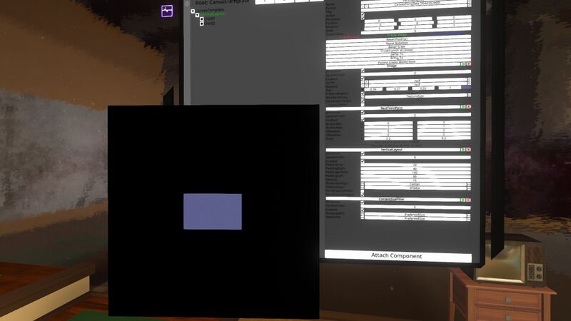
If, however, we now also attempt to shrink-wrap vertically by setting the ContentSizeFitter's VerticalFit to PreferredSize, we end up with no colored boxes. This is because the children have their preferred heights set to -1, and that means the heights will simply be set to zero.
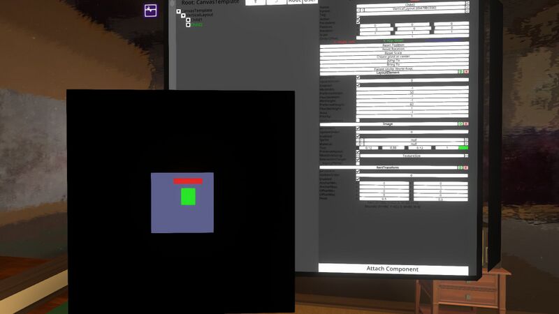
We can fix this by assigning each child's LayoutElement a preferred height. For example:


