Automated: update 'HighPriorityIntegration' description |
add info |
||
| Line 5: | Line 5: | ||
|Name=Bevel Plane Mesh | |Name=Bevel Plane Mesh | ||
}} | }} | ||
Used in old Legacy content like old inspectors and panels. | |||
<!--T:2--> | <!--T:2--> | ||
| Line 10: | Line 11: | ||
{{Table ComponentFields | {{Table ComponentFields | ||
|HighPriorityIntegration|Bool|{{Asset HighPriorityIntegration Field}} | |HighPriorityIntegration|Bool|{{Asset HighPriorityIntegration Field}} | ||
|OverrideBoundingBox|Bool| {{ | |OverrideBoundingBox|Bool| {{Template:Override Bounding Box}} | ||
|OverridenBoundingBox|BoundingBox| {{ | |OverridenBoundingBox|BoundingBox| {{Template:Overridden Bounding Box}} | ||
|Profile|ColorProfile| | |Profile|ColorProfile| {{Template:ProceduralMeshColorProfile}} | ||
|Width|Float| | |Width|Float| the width of the plane | ||
|Height|Float| | |Height|Float| the height of the plane | ||
|Thickness|Float| | |Thickness|Float| How 3D the plane should be, making it more like a box. | ||
|TopLeftCut|Float| | |TopLeftCut|Float| How much to bevel the top left corner. | ||
|BottomRightCut|Float| | |BottomRightCut|Float| How much to bevel the bottom right corner. | ||
|Relief|Bool| | |Relief|Bool| indent the center inwards or not. | ||
}} | }} | ||
<!--T:3--> | <!--T:3--> | ||
== Usage == | == Usage == | ||
Attach to a slot, and use the <code>Settup Renderer</code> button to view the mesh. | |||
<!--T:4--> | <!--T:4--> | ||
== Examples == | == Examples == | ||
Used in old legacy UI from [[Migrations|migrated]] content. | |||
[[Category:Components:Assets:Procedural Meshes:Legacy UI{{#translation:}}|Bevel Plane Mesh]] | [[Category:Components:Assets:Procedural Meshes:Legacy UI{{#translation:}}|Bevel Plane Mesh]] | ||
[[Category:Components{{#translation:}}|Bevel Plane Mesh]] | [[Category:Components{{#translation:}}|Bevel Plane Mesh]] | ||
Revision as of 16:36, 19 October 2024
This article or section is a stub. You can help the Resonite wiki by expanding it.
Component image 
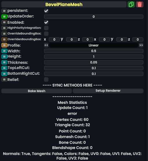
Bevel Plane Mesh component as seen in the Scene Inspector

Used in old Legacy content like old inspectors and panels.
Fields
| Name | Type | Description |
|---|---|---|
persistent
|
Bool | Determines whether or not this item will be saved to the server. |
UpdateOrder
|
Int | Controls the order in which this component is updated. |
Enabled
|
Bool | Controls whether or not this component is enabled. Some components stop their functionality when this field is disabled, but some don't. |
HighPriorityIntegration
|
Bool | If true, integrating this asset (e.g. processing procedural assets) gets higher priority than assets with this flag off. An example is user laser procedural meshes. |
OverrideBoundingBox
|
Bool | Force the bounding box calculated from this component to use OverridenBoundingBox instead of calculating when requested.
|
OverridenBoundingBox
|
BoundingBox | the bounding box this component should say it has when OverrideBoundingBox is enabled. Useful for bounding box calculations with Flux, or changing the selection box for this component when rendered.
|
Profile
|
ColorProfile | The profile that the vertex colors for this mesh should be displayed in. |
Width
|
Float | the width of the plane |
Height
|
Float | the height of the plane |
Thickness
|
Float | How 3D the plane should be, making it more like a box. |
TopLeftCut
|
Float | How much to bevel the top left corner. |
BottomRightCut
|
Float | How much to bevel the bottom right corner. |
Relief
|
Bool | indent the center inwards or not. |
Usage
Attach to a slot, and use the Settup Renderer button to view the mesh.
Examples
Used in old legacy UI from migrated content.