A Button allows for users to click on its slot. It provides visual feedback by altering the colors of graphics on the slot, and is needed for several other components, such as [[Text Field (Component)|Text Field]], to function.
A Button is a [[UIX]] component allows for users to click on its Rect. It provides visual feedback by altering the colors of graphics on the Rect, and is able to trigger several other components, such as [[Text Field (Component)|Text Field]], by using the [[Button Events]] system.
<!--T:3-->
<!--T:3-->
Line 28:
Line 28:
|HoverVibrate|VibratePreset|How a controller should vibrate when hovering over this button
|HoverVibrate|VibratePreset|How a controller should vibrate when hovering over this button
|PressVibrate|VibratePreset|How a controller should vibrate when pressing this button
|PressVibrate|VibratePreset|How a controller should vibrate when pressing this button
|ClearFocusOnPress|Bool|Makes the button stop being hovered when a press occurs
|ClearFocusOnPress|Bool|Defocuses any textfield (or other IFocusables) when pressed
|PassThroughHorizontalMovement|Bool|FIXME
|PassThroughHorizontalMovement|Bool|Whether or not press-and-drag movement should be passed to higher components
|PassThroughVerticalMovement|Bool|FIXME
(such as [[Scroll Rect (Component)|Scroll Rect]]s)
|PassThroughVerticalMovement|Bool|Whether or not press-and-drag movement should be passed to higher components
(such as [[Scroll Rect (Component)|Scroll Rect]]s)
|RequireLockInToPress|Bool|FIXME
|RequireLockInToPress|Bool|FIXME
|RequireInitialPress|Bool|FIXME
|RequireInitialPress|Bool|FIXME
Revision as of 05:59, 23 January 2024
This article or section is a stub. You can help the Resonite wiki by expanding it.
A Button is a UIX component allows for users to click on its Rect. It provides visual feedback by altering the colors of graphics on the Rect, and is able to trigger several other components, such as Text Field, by using the Button Events system.
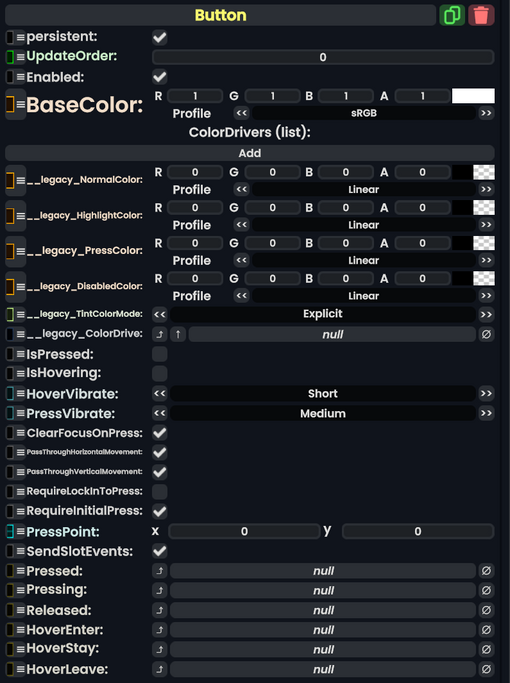
A list of sets of colors. Each one points at another component's color, and determines how it looks normally, when highlighted, when pressed, and when disabled