Component:Button

From Resonite Wiki
This page contains changes which are not marked for translation.
Component image 
Button component as seen in the Scene Inspector


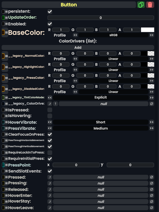
The Button component is an interactive UIX element that allows for users to click on its RectTransform. It can provide visual feedback by altering the colors of graphics on the RectTransform Slot, such as the Image component. This is able to trigger several other components, such as Text Field, by using the Button Events system.

Fields
Name Type Description
persistent Bool Determines whether or not this item will be saved to the server.
UpdateOrder Int Controls the order in which this component is updated.
Enabled Bool Controls whether or not this component is enabled.
BaseColor ColorX The color that all other tints will be based on
ColorDrivers list of ColorDriver A list of sets of colors. Each one points at another component's color, and determines how it looks normally, when highlighted, when pressed, and when disabled
__legacy_NormalColor ColorX Legacy normal button color.
__legacy_HighlightColor ColorX Legacy highlight button color.
__legacy_PressColor ColorX Legacy press button color.
__legacy_DisabledColor ColorX Legacy disabled button color.
__legacy_TintColorMode ColorMode Legacy tint button color.
__legacy_ColorDrive field drive of ColorX Legacy color drive button.
IsPressed Bool True if the button is being pressed
IsHovering Bool True if someone is hovering over the button
HoverVibrate VibratePreset How a controller should vibrate when hovering over this button
PressVibrate VibratePreset How a controller should vibrate when pressing this button
ClearFocusOnPress Bool If set, will defocus any currently focused TextEditor, DesktopInteractionRelay, or any other IFocusable when this button is pressed. Defaults to true.
PassThroughHorizontalMovement Bool Whether or not press-and-drag movement should be passed to higher components

(such as Scroll Rects)

PassThroughVerticalMovement Bool Whether or not press-and-drag movement should be passed to higher components

(such as Scroll Rects)

RequireLockInToPress Bool Internal. Defaults to false.
RequireInitialPress Bool Internal - Check for the initial press of the button. Defaults to true.
PressPoint Float2 The (x,y) coordinate where the button is being pressed
SendSlotEvents Bool If set, all Pressing, Pressed, Released, HoverEnter, HoverStay, and HoverLeave events are sent to all IButtonPressReceiver components within this component's slot. Defaults to true.
Pressed ButtonEventHandler Delegate. If set, this function is called with the Pressed event. Defaults to unset.
Pressing ButtonEventHandler Delegate. If set, this function is called with the Pressing event. Defaults to unset.
Released ButtonEventHandler Delegate. If set, this function is called with the Released event. Defaults to unset.
HoverEnter ButtonEventHandler Delegate. If set, this function is called with the HoverEnter event. Defaults to unset.
HoverStay ButtonEventHandler Delegate. If set, this function is called with the HoverStay event. Defaults to unset.
HoverLeave ButtonEventHandler Delegate. If set, this function is called with the HoverLeave event. Defaults to unset.

Usage

This can be used with ProtoFlux, and specifically the Button Events node. Allowing it to fire Impulses from this IButton reference.

Examples

A button from the Resonite Essentials folder.

There is a button UI Preset from the Resonite Essentials folder that users can use as a starting point for buttons.

Here is ProbablePrime's tutorial on Buttons:

Related Components

See Also