|BaseColor|ColorX|The color that all other tints will be based on
|BaseColor|ColorX|The color that all other tints will be based on
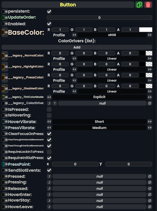
|ColorDrivers|ColorDriver|A list of sets of colors. Each one points at another component's color, and determines how it looks normally, when highlighted, when pressed, and when disabled
|ColorDrivers|{{RootFieldType|SyncList`1|[[Type:ColorDriver|ColorDriver]]}}|TypeAdv1=true|A list of sets of colors. Each one points at another component's color, and determines how it looks normally, when highlighted, when pressed, and when disabled
|IsPressed|Bool|True if the button is being pressed
|IsPressed|Bool|True if the button is being pressed
|IsHovering|Bool|True if someone is hovering over the button
|IsHovering|Bool|True if someone is hovering over the button
Line 31:
Line 37:
|PressPoint|Float2|The (x,y) coordinate where the button is being pressed
|PressPoint|Float2|The (x,y) coordinate where the button is being pressed
|SendSlotEvents|Bool|If set, all Pressing, Pressed, Released, HoverEnter, HoverStay, and HoverLeave events are sent to all [[IButtonPressReceiver]] components within this component's slot. Defaults to true.
|SendSlotEvents|Bool|If set, all Pressing, Pressed, Released, HoverEnter, HoverStay, and HoverLeave events are sent to all [[IButtonPressReceiver]] components within this component's slot. Defaults to true.
|Pressed|ButtonEventHandler|Delegate. If set, this function is called with the Pressed event. Defaults to unset.
|Pressed|{{RootFieldType|SyncDelegate`1|[[Type:ButtonEventHandler|ButtonEventHandler]]}}|TypeAdv19=true|Delegate. If set, this function is called with the Pressed event. Defaults to unset.
|Pressing|ButtonEventHandler|Delegate. If set, this function is called with the Pressing event. Defaults to unset.
|Pressing|{{RootFieldType|SyncDelegate`1|[[Type:ButtonEventHandler|ButtonEventHandler]]}}|TypeAdv20=true|Delegate. If set, this function is called with the Pressing event. Defaults to unset.
|Released|ButtonEventHandler|Delegate. If set, this function is called with the Released event. Defaults to unset.
|Released|{{RootFieldType|SyncDelegate`1|[[Type:ButtonEventHandler|ButtonEventHandler]]}}|TypeAdv21=true|Delegate. If set, this function is called with the Released event. Defaults to unset.
|HoverEnter|ButtonEventHandler|Delegate. If set, this function is called with the HoverEnter event. Defaults to unset.
|HoverEnter|{{RootFieldType|SyncDelegate`1|[[Type:ButtonEventHandler|ButtonEventHandler]]}}|TypeAdv22=true|Delegate. If set, this function is called with the HoverEnter event. Defaults to unset.
|HoverStay|ButtonEventHandler|Delegate. If set, this function is called with the HoverStay event. Defaults to unset.
|HoverStay|{{RootFieldType|SyncDelegate`1|[[Type:ButtonEventHandler|ButtonEventHandler]]}}|TypeAdv23=true|Delegate. If set, this function is called with the HoverStay event. Defaults to unset.
|HoverLeave|ButtonEventHandler|Delegate. If set, this function is called with the HoverLeave event. Defaults to unset.
|HoverLeave|{{RootFieldType|SyncDelegate`1|[[Type:ButtonEventHandler|ButtonEventHandler]]}}|TypeAdv24=true|Delegate. If set, this function is called with the HoverLeave event. Defaults to unset.
A Button is a UIX component allows for users to click on its Rect. It provides visual feedback by altering the colors of graphics on the Rect, and is able to trigger several other components, such as Text Field, by using the Button Events system.
A list of sets of colors. Each one points at another component's color, and determines how it looks normally, when highlighted, when pressed, and when disabled
If set, all Pressing, Pressed, Released, HoverEnter, HoverStay, and HoverLeave events are sent to all IButtonPressReceiver components within this component's slot. Defaults to true.