|DefaultFontMaterial|'''[[TextUnlitMaterial|TextUnlitMaterial]]'''|TypeAdv0=true| The default font to use for menu items.
|DisabledOutlineColor|ColorX|
|DisabledOutlineColor|ColorX| The outline color menu items should have when disabled.
|DisabledFillColor|ColorX|
|DisabledFillColor|ColorX| The color menu items should have when disabled.
|LogoCircle|Bool|
|LogoCircle|Bool| Whether this is a logo Circle from a long dead platform. he who shall not be named on the holy land that is this wiki - [[User:989onan|@989onan]].
|GenerateColliders|Bool|
|GenerateColliders|Bool| Whether to generate colliders for menu items.
|HighlightRadiusOffset|Float|
|HighlightRadiusOffset|Float| The tolerance for highlighting menu items.
|logoMenuMesh|'''[[Component:LegacyCircleSegmentMesh|LegacyCircleSegmentMesh]]'''|TypeAdv6=true| The logo mesh from a long dead platform. he who shall not be named on the holy land that is this wiki - [[User:989onan|@989onan]].
|independentMenuItems|{{RootFieldType|SyncList`1|[[#Item|Item]]}}|TypeAdv8=true| The list of independent menu items this list is managing for other tools.
|_overridesDrive|{{RootFieldType|DriveRef`1|[[Type:SyncList`1|SyncList`1]]<[[Type:MenuSegment|MenuSegment]]>}}|TypeAdv10=true| List of menu segments to use as overrides.
|_independentDrive|{{RootFieldType|DriveRef`1|[[Type:SyncList`1|SyncList`1]]<[[Type:MenuSegment|MenuSegment]]>}}|TypeAdv11=true| List of indepent drives of menu segments.
|menuItemsSlot|Slot|
|menuItemsSlot|Slot| Where to generate and place menu items for this component.
}}
== Item ==
{{Table TypeFields
|Enabled|Bool| Whether this item's button is enabled.
|AngleStart|Float| The angle on the circle where this starts.
|RadiusStart|Float| The inner radius from the center.
|ArcLength|Float| How much of the circle in degrees this takes up.
|Thickness|Float| The outer radius minus inner radius.
|Label|'''[[Component:TextRenderer|TextRenderer]]'''|TypeAdv5=true| The text label for this menu item.
|LabelColor|ColorX| The label color for this menu item.
|OutlineColor|ColorX| The outline color of this Menu item.
|FillColor|ColorX| The fill color of this Menu item
|Pressed|{{RootFieldType|SyncDelegate|[[Type:Action`1|Action`1]]<[[#Item|Item]]>}}|TypeAdv9=true| The Sync delegate to call and pass this item as the value when this menu item is pressed.
|IconMaterial|'''[[Component:UnlitMaterial|UnlitMaterial]]'''|TypeAdv10=true| The material for this Menu item's icon
|IconTexture|'''[[Component:StaticTexture2D|StaticTexture2D]]'''|TypeAdv11=true| The texture used for this menu item's icon
|RotateIcon|Bool| Whether to rotate the icon.
|IconRoot|Slot| The root of the icon graphic.
|Highlight|Bool| Whether this menu item is highlighted.
|IconPosition|{{RootFieldType|FieldDrive`1|[[Type:Float3|Float3]]}}|TypeAdv15=true| The field of the icon's position.
|IconRotation|{{RootFieldType|FieldDrive`1|[[Type:FloatQ|FloatQ]]}}|TypeAdv16=true| The field of the icon's rotation.
|IconScale|{{RootFieldType|FieldDrive`1|[[Type:Float3|Float3]]}}|TypeAdv17=true| The field of the icon's scale.
|ColliderRoot|Slot| The root slot of the collider for this menu item.
|ColliderPosition|{{RootFieldType|FieldDrive`1|[[Type:Float3|Float3]]}}|TypeAdv19=true| The field of the collider's position.
|ColliderScale|{{RootFieldType|FieldDrive`1|[[Type:Float3|Float3]]}}|TypeAdv20=true| The field of the collider's scale.
|ColliderRotation|{{RootFieldType|FieldDrive`1|[[Type:FloatQ|FloatQ]]}}|TypeAdv21=true| The field of the collider's rotation.
|LastPress|Double| The last time the button was pressed in world time.
|LabelRoot|Slot| The slot of the label visual.
|LabelPosition|{{RootFieldType|FieldDrive`1|[[Type:Float3|Float3]]}}|TypeAdv24=true| The position field of the label visual.
|LabelScale|{{RootFieldType|FieldDrive`1|[[Type:Float3|Float3]]}}|TypeAdv25=true| The scale field of the label visual.
|LabelColorDrive|{{RootFieldType|FieldDrive`1|[[Type:ColorX|ColorX]]}}|TypeAdv26=true| The color field of the label visual.
}}
== ItemsArc ==
{{Table TypeFields
|CenterItem|'''[[#Item|Item]]'''|TypeAdv0=true| The item to display in the center.
|SeparationAngle|Float| How far apart the items should be.
|_left|{{RootFieldType|SyncList`1|[[#ArcItem|ArcItem]]}}|TypeAdv2=true| all the items to display along the left side.
|_right|{{RootFieldType|SyncList`1|[[#ArcItem|ArcItem]]}}|TypeAdv3=true| all the items to display along the right side.
}}
}}
== Behavior ==
=== ArcItem ===
{{Table TypeFields
|Item|'''[[#Item|Item]]'''|TypeAdv0=true| The item this arc item contains.
|AngleStartDrive|{{RootFieldType|FieldDrive`1|[[Type:Float|Float]]}}|TypeAdv1=true| The field to drive with the starting position of this Menu item on the arc.
}}
== Examples ==
== Usage ==
Just don't.
== See Also ==
== See Also ==
Line 31:
Line 77:
[[Category:Components{{#translation:}}|Legacy Segment Circle Menu Controller]]
[[Category:Components{{#translation:}}|Legacy Segment Circle Menu Controller]]
[[Category:Components With Nested Types{{#translation:}}|Legacy Segment Circle Menu Controller]]
[[Category:Components With Nested Types{{#translation:}}|Legacy Segment Circle Menu Controller]]
[[Category:ComponentStubs]]
Revision as of 21:22, 22 January 2025
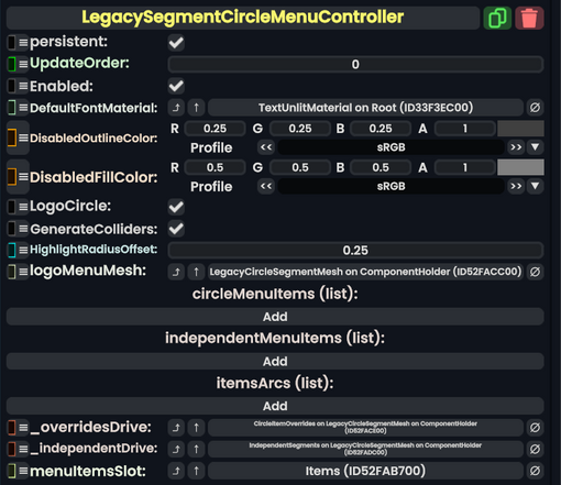
Component image
Legacy Segment Circle Menu Controller component as seen in the Scene Inspector
This is a Legacy item and should not be used.
From a long dead platform. he who shall not be named on the holy land that is this wiki