Component:OverlappingLayout: Difference between revisions

From Resonite Wiki
Automated: create new component page
 
add info
 
Line 3: Line 3:
|Name=Overlapping Layout
|Name=Overlapping Layout
}}
}}
{{stub}}
The '''OverlappingLayout''' is best explained on the [[UIX]] page. The description for such is as follows:


== Usage ==
A [Overlapping layout] layout overlaps or places on top of another layout in the same space.
 
== Fields ==
{{Table ComponentFields
|PaddingTop|Float|
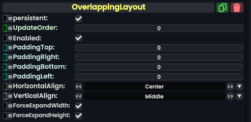
|PaddingTop|Float| The padding from the center content to the top side.
|PaddingRight|Float|
|PaddingRight|Float| The padding from the center content to the right side.
|PaddingBottom|Float|
|PaddingBottom|Float| The padding from the center content to the bottom side.
|PaddingLeft|Float|
|PaddingLeft|Float| The padding from the center content to the left side.
|HorizontalAlign|LayoutHorizontalAlignment|
|HorizontalAlign|LayoutHorizontalAlignment| The alignment of the content horizontally.
|VerticalAlign|LayoutVerticalAlignment|
|VerticalAlign|LayoutVerticalAlignment| The alignment of the content vertically.
|ForceExpandWidth|Bool|
|ForceExpandWidth|Bool| Whether content inside this layout going beyond the normal container size of this layout should be forced to go beyond the container so it fits width wise.
|ForceExpandHeight|Bool|
|ForceExpandHeight|Bool| Whether content inside this layout going beyond the normal container size of this layout should be forced to go beyond the container so it fits height wise.
}}
}}


== Behavior ==
== Usage ==
See [[UIX]].


== Examples ==
== Examples ==
The default UI elements from Resonite like the slider and buttons.


== See Also ==
== See Also ==
* [[UIX]]


[[Category:Components:UIX:Layout{{#translation:}}|Overlapping Layout]]
[[Category:Components:UIX:Layout{{#translation:}}|Overlapping Layout]]
[[Category:Components{{#translation:}}|Overlapping Layout]]
[[Category:Components{{#translation:}}|Overlapping Layout]]
[[Category:ComponentStubs]]

Latest revision as of 19:00, 29 January 2025

Component image 
Overlapping Layout component as seen in the Scene Inspector

The OverlappingLayout is best explained on the UIX page. The description for such is as follows:

A [Overlapping layout] layout overlaps or places on top of another layout in the same space.

Fields

Fields
Name Type Description
persistent Bool Determines whether or not this item will be saved to the server.
UpdateOrder Int Controls the order in which this component is updated.
Enabled Bool Controls whether or not this component is enabled. Some components stop their functionality when this field is disabled, but some don't.
PaddingTop Float The padding from the center content to the top side.
PaddingRight Float The padding from the center content to the right side.
PaddingBottom Float The padding from the center content to the bottom side.
PaddingLeft Float The padding from the center content to the left side.
HorizontalAlign LayoutHorizontalAlignment The alignment of the content horizontally.
VerticalAlign LayoutVerticalAlignment The alignment of the content vertically.
ForceExpandWidth Bool Whether content inside this layout going beyond the normal container size of this layout should be forced to go beyond the container so it fits width wise.
ForceExpandHeight Bool Whether content inside this layout going beyond the normal container size of this layout should be forced to go beyond the container so it fits height wise.

Usage

See UIX.

Examples

The default UI elements from Resonite like the slider and buttons.

See Also