Component image 
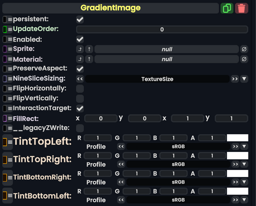
Gradient Image component as seen in the Scene Inspector

The GradiantImage component takes in a SpriteProvider or Material and controls the image color using the four corners of the image, then gradients them into the image.
| Name | Type | Description |
|---|---|---|
persistent
|
Bool | Determines whether or not this item will be saved to the server. |
UpdateOrder
|
Int | Controls the order in which this component is updated. |
Enabled
|
Bool | Controls whether or not this component is enabled. Some components stop their functionality when this field is disabled, but some don't. |
Sprite
|
Sprite | The sprite to use as the image. |
Material
|
Material | The Material to use as the image. |
PreserveAspect
|
Bool | Preserves the aspect ratio of this image provided. |
NineSliceSizing
|
NineSliceSizing | Tells how the image gets 9-sliced on this UIX. |
FlipHorizontally
|
Bool | Flips the image horizontally (but not the color). |
FlipVertically
|
Bool | Flips the image vertically (but not the color). |
InteractionTarget
|
Bool | Makes this image as the interaction target for this UIX. |
FillRect
|
Rect | The filling rect for this image. |
__legacyZWrite
|
Bool | The legacy Z writing for this image. |
TintTopLeft
|
ColorX | The color of this top left corner. |
TintTopRight
|
ColorX | The color of this top right corner. |
TintBottomRight
|
ColorX | The color of this bottom right corner. |
TintBottomLeft
|
ColorX | The color of this bottom left corner. |
Usage
You can make fancy effects and icons using this component, especially if your hue shifting the different color corners.