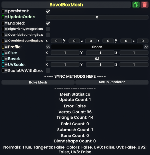
Component image 
Bevel Box Mesh component as seen in the Scene Inspector

The BevelBoxMesh component can be placed in a MeshRenderer to create a box with beveled edges.
Fields
| Name | Type | Description |
|---|---|---|
persistent
|
Bool | Determines whether or not this item will be saved to the server. |
UpdateOrder
|
Int | Controls the order in which this component is updated. |
Enabled
|
Bool | Controls whether or not this component is enabled. Some components stop their functionality when this field is disabled, but some don't. |
HighPriorityIntegration
|
Bool | If true, integrating this asset (e.g. processing procedural assets) gets higher priority than assets with this flag off. An example is user laser procedural meshes. |
OverrideBoundingBox
|
Bool | Force the bounding box calculated from this component to use OverridenBoundingBox instead of calculating when requested.
|
OverridenBoundingBox
|
BoundingBox | the bounding box this component should say it has when OverrideBoundingBox is enabled. Useful for bounding box calculations with Flux, or changing the selection box for this component when rendered.
|
Profile
|
ColorProfile | The profile that the vertex colors for this mesh should be displayed in. |
Size
|
Float3 | The 3-Dimentional scale of the mesh. |
Bevel
|
Float | Size of the rounded edges. |
UVScale
|
Float3 | The inverse of the size the material should appear on the surface as. |
ScaleUVWithSize
|
Bool | Change uv scale visually with the value of Size
|
Usage
Attach to a slot, and assign to a Mesh Renderer to see what it looks like. Don't forget to use a material.
Examples

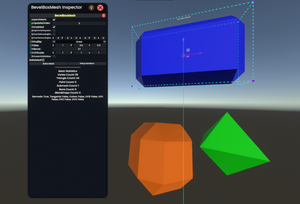
The BevelBoxMesh component can be used to create many interesting shapes by mixing different sizes and bevels.