Component:ContextMenuItemSource
From Resonite Wiki
More actions
This article or section is a stub. You can help the Resonite wiki by expanding it.
Component image 
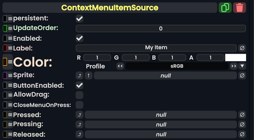
Context Menu Item Source component as seen in the Scene Inspector

The ContextMenuItemSource component is used to add additional items to a context menu. To show up, it needs to be either within a Context Menu Submenu or assigned to a Root Context Menu Item as its Item.
Fields
| Name | Type | Description |
|---|---|---|
persistent
|
Bool | Determines whether or not this item will be saved to the server. |
UpdateOrder
|
Int | Controls the order in which this component is updated. |
Enabled
|
Bool | Controls whether or not this component is enabled. Some components stop their functionality when this field is disabled, but some don't. |
Label
|
String | The text label next to the item. |
Color
|
ColorX | The background/border color of the item. |
Sprite
|
IAssetProvider`1<Sprite> | The icon that is displayed on the item. |
ButtonEnabled
|
Bool | Whether or not the button is active. If false, it will be greyed out and unclickable. |
AllowDrag
|
Bool | Whether or not the user can drag onto the button from the center of the context menu to click it. |
CloseMenuOnPress
|
Bool | Whether or not the context menu should be closed after the item is pressed. |
Pressed
|
delegate of identity ButtonEventHandler | See ButtonEvents |
Pressing
|
delegate of identity ButtonEventHandler | See ButtonEvents |
Released
|
delegate of identity ButtonEventHandler | See ButtonEvents |
Usage
This article or section is a stub. You can help the Resonite wiki by expanding it.
Examples
This article or section is a stub. You can help the Resonite wiki by expanding it.
Related Issues
This article or section is a stub. You can help the Resonite wiki by expanding it.