Component:Checkbox

From Resonite Wiki
This page contains changes which are not marked for translation.
Component image 
Checkbox component as seen in the Scene Inspector


The Checkbox component is a UIX element used with a Button component to provide a toggling state whenever the button is pressed.

Fields
Name Type Description
persistent Bool Determines whether or not this item will be saved to the server.
UpdateOrder Int Controls the order in which this component is updated.
Enabled Bool Controls whether or not this component is enabled.
State Bool The current state of thie check box.
TargetState direct RelayRef`1<IField`1<Bool>> The Bool field to drive with the state of the checkbox.
CheckVisual field drive of Bool 
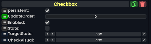
The Bool field controlling visibility of the visual to display when the checkbox is in the checked state.

Usage

Checkboxes are great for settings and options in your designs.

Examples

A checkbox from the Resonite Essentials folder.

There is a checkbox UI Preset from the Resonite Essentials folder that users can use as a starting point for checkboxes.

Typically you'd have a child of the checkbox's slot containing an Image component, and that slot's Active property is driven using the CheckVisual property of the checkbox. In addition, you can have a SpriteProvider driving the Image component.

Here is ProbablePrime's tutorial on checkboxes:

Related Components