Component:GridLayout
This is used to make a nice grid layout of a user's content.
More actions
Component image 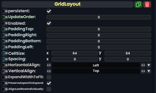
GridLayout component as seen in the Scene Inspector

The GridLayout component aligns the UIX elements from left to right, top to bottom. This component also comes with controllable parameters that a user can use to adjust the way the grid layout is represented on the Canvas or element slot.
| Name | Type | Description |
|---|---|---|
persistent
|
Bool | Determines whether or not this item will be saved to the server. |
UpdateOrder
|
Int | Controls the order in which this component is updated. |
Enabled
|
Bool | Controls whether or not this component is enabled. Some components stop their functionality when this field is disabled, but some don't. |
PaddingTop
|
Float | Makes padding on the top of this grid, separating it from the top. |
PaddingRight
|
Float | Makes padding on the right of this grid, separating it from the right. |
PaddingBottom
|
Float | Makes padding on the bottom of this grid, separating it from the bottom. |
PaddingLeft
|
Float | Makes padding on the left of this grid, separating it from the left. |
CellSize
|
Float2 | The size of each content cell. |
Spacing
|
Float2 | Makes padding between the content cells of this grid, separating it evenly. |
HorizontalAlign
|
LayoutHorizontalAlignment | how this grid should be aligned horizontally. |
VerticalAlign
|
LayoutVerticalAlignment | how this grid should be aligned vertically. |
ExpandWidthToFit
|
Bool | Extends this grid to fit the entire UIX element that it is on. |
PreserveAspectOnExpand
|
Bool | Preserves the aspect ratio when expanded to fit. |
AlignLastRowIndividually
|
Bool | Alighns the last row for this grid seprately. |
Usage
This is used to make a nice grid layout of a user's content. The user has a lot of control when it comes to making this kind of layout, especially when it comes to the amount of content cells, expanding and scaling those cells, and alignments.
Examples
Videos
ProbablePrime's tutorial video on the Grid Layout: