Component:InventoryItemUI
The InventoryItemUI component is used to represent an item or folder in the Inventory.
More actions
Component image 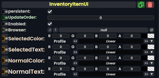
Inventory Item UI component as seen in the Scene Inspector

The InventoryItemUI component is used to represent an item or folder in the Inventory.
Fields
| Name | Type | Description |
|---|---|---|
persistent
|
Bool | Determines whether or not this item will be saved to the server. |
UpdateOrder
|
Int | Controls the order in which this component is updated. |
Enabled
|
Bool | Controls whether or not this component is enabled. Some components stop their functionality when this field is disabled, but some don't. |
Browser
|
direct RelayRef`1<BrowserDialog> | The browser this belongs too. |
SelectedColor
|
ColorX | The color of this item when selected. |
SelectedText
|
ColorX | The text of this item when selected. |
NormalColor
|
ColorX | The color of this item when not selected. |
NormalText
|
ColorX | The text of this item when not selected. |
Usage
Not used by the user.
Examples
Makes up the Inventory UI.