Component:LegacySegmentCircleProgress
The LegacySegmentCircleProgress component was used to handle progress bars on arc circles. Was used in loading progress bars.
More actions
Component image 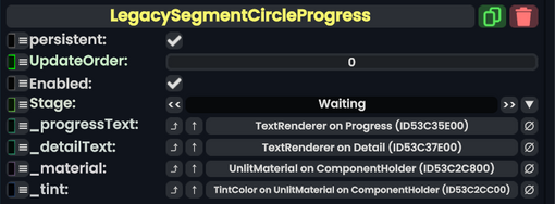
Legacy Segment Circle Progress component as seen in the Scene Inspector

The LegacySegmentCircleProgress component was used to handle progress bars on arc circles. Was used in loading progress bars.
Fields
| Name | Type | Description |
|---|---|---|
persistent
|
Bool | Determines whether or not this item will be saved to the server. |
UpdateOrder
|
Int | Controls the order in which this component is updated. |
Enabled
|
Bool | Controls whether or not this component is enabled. Some components stop their functionality when this field is disabled, but some don't. |
Stage
|
ProgressStage | The stage in loading the progress bar is at. |
_progressText
|
TextRenderer | The progress text indicator visual used to indicate the current progress. |
_detailText
|
TextRenderer | The detail text indicator visual used to indicate the current progress details. |
_material
|
UnlitMaterial | The material used in the visual. |
_tint
|
field drive of ColorX | The field to drive with the progress bar tint. |
Usage
Not used directly by the user. Used in legacy content.
Examples
Used in legacy content.