Component:PagingControl
Great for counting items, and for controlling UI that can switch pages.
More actions
Component image 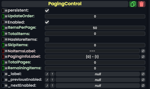
Paging Control component as seen in the Scene Inspector

The PagingControl component allows for counting up a number of items specified, then outputs it to either a Text or TextRenderer component.
Fields
| Name | Type | Description |
|---|---|---|
persistent
|
Bool | Determines whether or not this item will be saved to the server. |
UpdateOrder
|
Int | Controls the order in which this component is updated. |
Enabled
|
Bool | Controls whether or not this component is enabled. Some components stop their functionality when this field is disabled, but some don't. |
ItemsPerPage
|
Int | The increment to count up by. |
TotalItems
|
Int | The total amount of items. |
HasMoreItems
|
Bool | Allows to count beyond the max set of items. |
SkipItems
|
Int | Skips items that are listed here. |
NoItemsLabel
|
String | Shows the output as this when there are no items. |
PagingInfoLabel
|
String | The structure of how the items will be shown to the user. |
TotalPages
|
raw output of Int | The total amount of items. |
RemainingItems
|
raw output of Int | Shows how many items are remaining. |
_label
|
field drive of String | The text to output. |
_previousEnabled
|
field drive of Bool | Becomes false if the minimum is currently reached. |
_nextEnabled
|
field drive of Bool | Becomes false if the maximum is currently reached. |
Sync Delegates
| Method Name | Method type and Arguments. | Is the method hidden? | Description |
|---|---|---|---|
NextPage:ButtonEventHandler
|
ButtonEventHandler | ✓ | Switches to the next page via button. |
PreviousPage:ButtonEventHandler
|
ButtonEventHandler | ✓ | Switches to the previous page via button. |
NextPage:Action
|
Action | X | Switches to the next page via action. |
PreviousPage:Action
|
Action | X | Switches to the previous page via action. |
Usage
Great for counting items, and for controlling UI that can switch pages.