Component:VerticalLayout
More actions
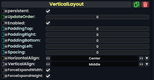
The VerticalLayout component is used to layout child UIX element slots in a column, top to bottom.
The order of the objects depends on each child's OrderOffset property. Normally these are 0, but if you change it, the children will be ordered by increasing OrderOffset, with children of equal OrderOffset being ordered by the time they were added to that parent slot.
| Name | Type | Description |
|---|---|---|
persistent
|
Bool | Determines whether or not this item will be saved to the server. |
UpdateOrder
|
Int | Controls the order in which this component is updated. |
Enabled
|
Bool | Controls whether or not this component is enabled. Some components stop their functionality when this field is disabled, but some don't. |
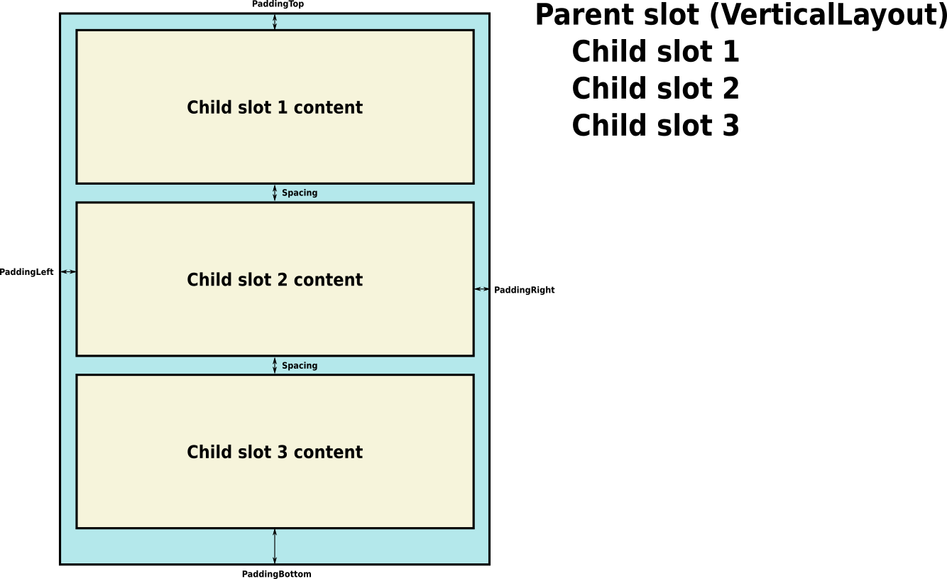
PaddingTop
|
Float | The padding to add, in pixels, at the top of the entire layout. |
PaddingRight
|
Float | The padding to add, in pixels, at the right of the entire layout. |
PaddingBottom
|
Float | The padding to add, in pixels, at the bottom of the entire layout. |
PaddingLeft
|
Float | The padding to add, in pixels, at the left of the entire layout. |
Spacing
|
Float | The padding to add, in pixels, between each object. |
HorizontalAlign
|
LayoutHorizontalAlignment | The horizontal alignment to use for the child objects in the layout. |
VerticalAlign
|
LayoutVerticalAlignment | The vertical alignment to use for the child objects in the layout. |
ForceExpandWidth
|
Bool | Whether to force the children to expand to fill the available horizontal space. |
ForceExpandHeight
|
Bool | Whether to force the children to expand to fill the available vertical space. |
Usage
The VerticalLayout component places its child layout elements on top of each other. Their heights are determined by their respective minimum, preferred, and flexible heights according to the following model:
- The minimum heights of all the child layout elements are added together and the spacing between them plus the top and bottom padding is added as well. The result is the minimum height of the VerticalLayout.
- The preferred heights of all the child layout elements are added together and the spacing between them plus the top and bottom padding is added as well. The result is the preferred height of the VerticalLayout.
- If the VerticalLayout is at its minimum height or smaller, all the child layout elements will also have their minimum height.
- The closer the VerticalLayout is to its preferred height, the closer each child layout element will also get to their preferred height.
- If the VerticalLayout is taller than its preferred height, it will distribute the extra available space proportionally to the child layout elements according to their respective flexible heights.
For minimum, preferred, and flexible heights of child slots, use LayoutElement.
Padding and spacing
Examples
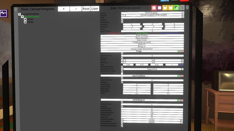
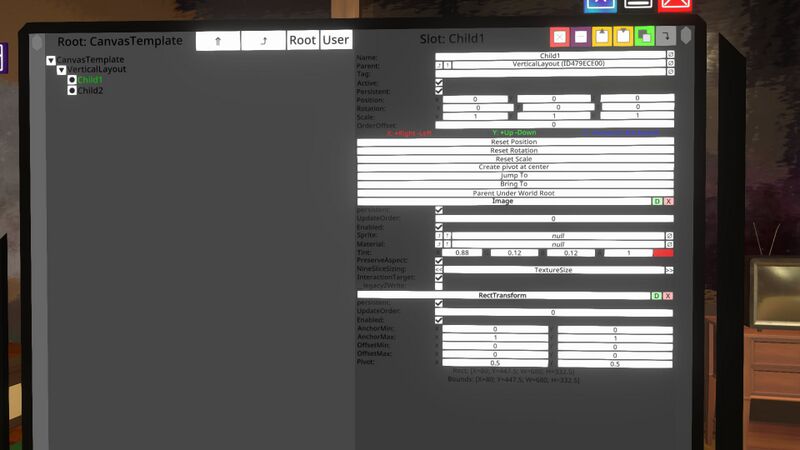
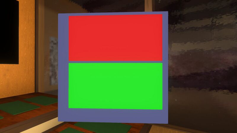
This example shows a VerticalLayout with two children. Each child is just an Image, with the first child being red and the second being green. Note that since Images have no minimum or preferred size, the VerticalLayout's ForceExpandWidth and ForceExpandHeight properties must be set, otherwise the children will simply have a width or height of zero. The VerticalLayout is as big as its parent allows.
VerticalLayout in the inspector:
The first child in the inspector:
The result:
If we add LayoutElements to each child, we can affect the sizes. Here, we add a LayoutElement to the first child, setting its FlexibleHeight to 2, and also to the second child, setting its FlexibleHeight to 1:
The result shows that the child heights are proportional, 2 to 1:
By specifying a preferred width for each child and turning off ForceExpandWidth on the VerticalLayout, we can have each child stick to its preferred width. Here, we set the first child's preferred width to 100 and the second child's preferred width to 50:
Videos
ProbablePrime's tutorial video on the Vertical Layout:
