Component:OutlinedArc
A user could make fancy effects like a [https://en.
More actions
(Redirected from OutlinedArc (Component))
Component image 
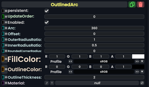
OutlinedArc component as seen in the Scene Inspector

The OutlinedArc component takes in many parameters to create a circular image or design and can be controlled using those parameters. Then this renders onto the UIX.
| Name | Type | Description |
|---|---|---|
persistent
|
Bool | Determines whether or not this item will be saved to the server. |
UpdateOrder
|
Int | Controls the order in which this component is updated. |
Enabled
|
Bool | Controls whether or not this component is enabled. Some components stop their functionality when this field is disabled, but some don't. |
Arc
|
Float | The amount to arc around the center. |
Offset
|
Float | The amount to rotate around the center. |
OuterRadiusRatio
|
Float | The outer distance for this arc from the center. |
InnerRadiusRatio
|
Float | The inner distance for this arc from the center. |
RoundedCornerRadius
|
Float | The amount of how rounded the edges of the arc end points are. |
FillColor
|
ColorX | The inner color (filled in color) of this arc. |
OutlineColor
|
ColorX | The outer color (the outline) of this arc. |
OutlineThickness
|
Float | The amount to thicken for the outline. |
Material
|
Material | Uses a material for the arc. |
Usage
A user could make fancy effects like a loading circular throbber, or menu buttons that arc around.
Examples
Similar to how the context menu arcs around.