(2 intermediate revisions by one other user not shown)
Line 2:
Line 2:
<translate>
<translate>
<!--T:1-->
<!--T:1-->
{{stub}}
{{Infobox Component
{{Infobox Component
|Image=ScaleGroupComponent.png
|Image=ScaleGroupComponent.png
|Name=Scale Group
|Name=Scale Group
}}
}}
The '''ScaleGroup''' component is used to make a touchable selection system that can be used to select items like the Steam<sup>tm</sup> store and big picture menus.
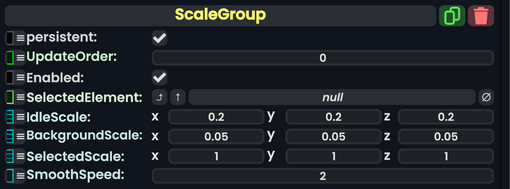
|SelectedElement|'''[[Component:ScaleElement|ScaleElement]]'''|TypeAdv0=true| The currently selected element for this group.
|IdleScale|Float3|
|IdleScale|Float3| The scale of elements when they aren't selected.
|BackgroundScale|Float3|
|BackgroundScale|Float3| The scale of elements when they go into the background.
|SelectedScale|Float3|
|SelectedScale|Float3| The scale of any element when it is selected.
|SmoothSpeed|Float|
|SmoothSpeed|Float| The speed at which elements change scale when they change state.
}}
}}
<!--T:3-->
<!--T:3-->
== Usage ==
== Usage ==
Used with a [[Component:ScaleElement|Scale Element]] list to make a list of selectable elements. Using ProtoFlux to get the slot of the <code>SelectedElement</code> can make this useful for a physical based selection system usable in both VR and Desktop.
<!--T:4-->
<!--T:4-->
== Examples ==
== Examples ==
Item made by brecert that shows the component in action on 5 clickable boxes, that grow to the ScaleGroup's <code>SelectedScale</code> when clicked.
The speed at which elements change scale when they change state.
Usage
Used with a Scale Element list to make a list of selectable elements. Using ProtoFlux to get the slot of the SelectedElement can make this useful for a physical based selection system usable in both VR and Desktop.
Examples
Item made by brecert that shows the component in action on 5 clickable boxes, that grow to the ScaleGroup's SelectedScale when clicked.
resdb:///3bfbdceb6a3ed18ede90032c291ddd9051682f6e454ba1d3b2ba14d34e84c884.brson