Filled in this component page. Added a picture link. Changed link to an actual video.
(2 intermediate revisions by 2 users not shown)
Line 2:
Line 2:
<translate>
<translate>
<!--T:1-->
<!--T:1-->
{{stub}}
{{Infobox Component
{{Infobox Component
|Image=CheckboxComponent.png
|Image=CheckboxComponent.png
Line 9:
Line 8:
<!--T:2-->
<!--T:2-->
== Intoduction ==
The '''Checkbox''' component is a [[UIX]] element used with a [[Button (Component)|Button]] component to provide a toggling state whenever the button is pressed.
The '''Checkbox''' component is used with a [[Button (Component)|Button]] component to provide a toggling state whenever the button is pressed.
<!--T:3-->
<!--T:3-->
== Usage ==
{{Table ComponentFields
{{Table ComponentFields
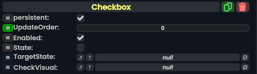
|State|Bool|
|State|Bool|The current state of thie check box.
|TargetState|IField`1|TypeString1=IField<Bool>|The Bool field to drive with the state of the checkbox
|TargetState|{{RootFieldType|RelayRef`1|[[Type:IField`1|IField`1]]<[[Type:Bool|Bool]]>}}|TypeAdv1=true|The Bool field to drive with the state of the checkbox.
|CheckVisual|IField`1|TypeString2=IField<Bool>|The Bool field controlling visibility of the visual to display when the checkbox is in the checked state
|CheckVisual|{{RootFieldType|FieldDrive`1|[[Type:Bool|Bool]]}}|TypeAdv2=true|The Bool field controlling visibility of the visual to display when the checkbox is in the checked state.
}}
}}
<!--T:4-->
<!--T:4-->
== Behavior ==
== Usage ==
Checkboxes are great for settings and options in your designs.
<!--T:5-->
<!--T:5-->
== Examples ==
== Examples ==
[[File:UIX Checkbox Example 01.png|alt=A checkbox from the Resonite Essentials folder.|thumb|A checkbox from the Resonite Essentials folder.]]
There is a checkbox UI Preset from the Resonite Essentials folder that users can use as a starting point for checkboxes.
Typically you'd have a child of the checkbox's slot containing an [[Image (Component)|Image]] component, and that slot's Active property is driven using the CheckVisual property of the checkbox. In addition, you can have a [[SpriteProvider (Component)|SpriteProvider]] driving the Image component.
Typically you'd have a child of the checkbox's slot containing an [[Image (Component)|Image]] component, and that slot's Active property is driven using the CheckVisual property of the checkbox. In addition, you can have a [[SpriteProvider (Component)|SpriteProvider]] driving the Image component.
See also [[User:ProbablePrime|ProbablePrime]]'s [https://www.youtube.com/watch?v=B2G708bnBeM tutorial on checkboxes].
Here is [[User:ProbablePrime|ProbablePrime]]'s tutorial on checkboxes:
The Bool field controlling visibility of the visual to display when the checkbox is in the checked state.
Usage
Checkboxes are great for settings and options in your designs.
Examples
A checkbox from the Resonite Essentials folder.
There is a checkbox UI Preset from the Resonite Essentials folder that users can use as a starting point for checkboxes.
Typically you'd have a child of the checkbox's slot containing an Image component, and that slot's Active property is driven using the CheckVisual property of the checkbox. In addition, you can have a SpriteProvider driving the Image component.