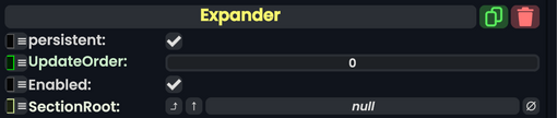
The '''Expander''' component is an intractable [[UIX]] element that expands a section called the <code>SectionRoot</code> under itself. The <code>SectionRoot</code>'s active state will toggle when that expander is triggered, expanding it under the [[Slot]] the expander is on. This can be seen on the [[Scene Inspector]].
<!--T:3-->
<!--T:3-->
== Usage ==
{{Table ComponentFields
{{Table ComponentFields
|SectionRoot|Slot|
|SectionRoot|Slot|The slot to expend with, by activating the slot that is referenced when toggled.
}}
}}
<!--T:4-->
<!--T:4-->
== Behavior ==
== Usage ==
This component is combined with the [[Component:Button|Button]] component to trigger this expander component. This component is also combined with the [[Component:TextExpandIndicator|TextExpandIndicator]] component to drive the text and show the user that this expander has expanded, collapsed, or is empty.
The Expander component is an intractable UIX element that expands a section called the SectionRoot under itself. The SectionRoot's active state will toggle when that expander is triggered, expanding it under the Slot the expander is on. This can be seen on the Scene Inspector.
The slot to expend with, by activating the slot that is referenced when toggled.
Usage
This component is combined with the Button component to trigger this expander component. This component is also combined with the TextExpandIndicator component to drive the text and show the user that this expander has expanded, collapsed, or is empty.