The '''ArcLayout''' is a component primarily used in a [[User|user's]] [[Context menu|context menu]]. It requires a set of [[Slot|slots]] under the slot the component is attached to, and each slot needs an [[Component:OutlinedArc|OutlinedArc Component]] and an [[Component:ArcSegmentLayout|ArcSegmentLayout Component]].
Arc layout is a component primarily used in a user's context menu. It requires a set of [[Slot|slots]] under the slot the component is attached to, and each slot needs an [[Component:OutlinedArc|OutlinedArc Component]] and an [[Component:ArcSegmentLayout|ArcSegmentLayout Component]].
<!--T:3-->
<!--T:3-->
== Usage ==
{{Table ComponentFields
{{Table ComponentFields
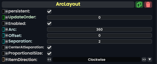
|Arc|Float| The amount of the circle in degrees to cover with the arc elements
|Arc|Float| The amount of the circle in degrees to cover with the arc elements.
|Offset|Float| the amount to rotate the arc elements around the center in degrees from the default position
|Offset|Float| the amount to rotate the arc elements around the center in degrees from the default position.
|Separation|Float| how much to separate the elements from each other
|Separation|Float| how much to separate the elements from each other.
|CenterAtSeparation|Bool| {{Stub}}
|CenterAtSeparation|Bool|Centers the separation point of this layout.
|ProportionalSize|Bool| {{Stub}}
|ProportionalSize|Bool|Keep all segments of the arc proportional in size.
|ItemDirection|Direction| How to arrange the elements in order from the initial position
|ItemDirection|'''[[#Direction|Direction]]'''|TypeAdv5=true| How to arrange the elements in order from the initial position.