The '''GridLayout''' component aligns the [[UIX]] elements from left to right, top to bottom. This component also comes with controllable parameters that a [[User|user]] can use to adjust the way the grid layout is represented on the [[Component:Canvas|Canvas]] or element [[Slot|slot]].
<!--T:3-->
<!--T:3-->
== Usage ==
{{Table ComponentFields
{{Table ComponentFields
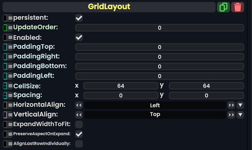
|PaddingTop|Float|
|PaddingTop|Float|Makes padding on the top of this grid, separating it from the top.
|PaddingRight|Float|
|PaddingRight|Float|Makes padding on the right of this grid, separating it from the right.
|PaddingBottom|Float|
|PaddingBottom|Float|Makes padding on the bottom of this grid, separating it from the bottom.
|PaddingLeft|Float|
|PaddingLeft|Float|Makes padding on the left of this grid, separating it from the left.
|CellSize|Float2|
|CellSize|Float2|The size of each content cell.
|Spacing|Float2|
|Spacing|Float2|Makes padding between the content cells of this grid, separating it evenly.
|HorizontalAlign|LayoutHorizontalAlignment|
|HorizontalAlign|LayoutHorizontalAlignment|how this grid should be aligned horizontally.
|VerticalAlign|LayoutVerticalAlignment|
|VerticalAlign|LayoutVerticalAlignment|how this grid should be aligned vertically.
|ExpandWidthToFit|Bool|
|ExpandWidthToFit|Bool|Extends this grid to fit the entire [[UIX]] element that it is on.
|PreserveAspectOnExpand|Bool|
|PreserveAspectOnExpand|Bool|Preserves the aspect ratio when expanded to fit.
|AlignLastRowIndividually|Bool|
|AlignLastRowIndividually|Bool|Alighns the last row for this grid seprately.
}}
}}
<!--T:4-->
<!--T:4-->
== Behavior ==
== Usage ==
This is used to make a nice grid layout of a user's content. The user has a lot of control when it comes to making this kind of layout, especially when it comes to the amount of content cells, expanding and scaling those cells, and alignments.
<!--T:5-->
<!--T:5-->
== Examples ==
== Examples ==
=== Videos ===
[[User:ProbablePrime|ProbablePrime]]'s tutorial video on the Grid Layout:
The GridLayout component aligns the UIX elements from left to right, top to bottom. This component also comes with controllable parameters that a user can use to adjust the way the grid layout is represented on the Canvas or element slot.
This is used to make a nice grid layout of a user's content. The user has a lot of control when it comes to making this kind of layout, especially when it comes to the amount of content cells, expanding and scaling those cells, and alignments.