m Alizard moved page Component:WorldDetail to Component:LegacyWorldDetail: Obsoleted component's name changed |
add info |
||
| Line 3: | Line 3: | ||
|Name=World Detail | |Name=World Detail | ||
}} | }} | ||
The '''WorldDetail''' component is used to display information about a world to a UI. | |||
== Usage == | == Usage == | ||
{{Table ComponentFields | {{Table ComponentFields | ||
|UpdatingUser|{{RootFieldType|UserRef}}|TypeAdv0=true| | |UpdatingUser|{{RootFieldType|UserRef}}|TypeAdv0=true| The user managing updates for this component. | ||
|WorldOrSessionId|String| | |WorldOrSessionId|String| The world or session ID to get info on. | ||
|_visited|Bool| | |_visited|Bool| Whether <code>UpdatingUser</code> has visited this world. | ||
|_totalActiveUsers|Int| | |_totalActiveUsers|Int| How many active ussrs are in the world. | ||
|_totalContacts|Int| | |_totalContacts|Int| How many contacts of <code>UpdatingUser</code> are in the world. | ||
|Expanded|Bool| | |Expanded|Bool| Whether the world item UI has been hovered over in the dash. | ||
|CompactDetailExpanded|Bool| | |CompactDetailExpanded|Bool| Whether the extra detail has been expanded. | ||
|CompactDetailCategory|'''[[#DetailCategory|DetailCategory]]'''|TypeAdv7=true| | |CompactDetailCategory|'''[[#DetailCategory|DetailCategory]]'''|TypeAdv7=true| The detail to show in the compact view. | ||
|ModalCompactSize|Float2| | |ModalCompactSize|Float2| The size of the world item when not hovered over. | ||
|ModalExpandedSize|Float2| | |ModalExpandedSize|Float2| The size of the world item when hovered over. | ||
|_hostText|'''[[Component:Text|Text]]'''|TypeAdv10=true| | |_hostText|'''[[Component:Text|Text]]'''|TypeAdv10=true| The Text Component showing the host name. | ||
|_sessionItemsRoot|Slot| | |_sessionItemsRoot|Slot| The slot containing current sessions of the world. | ||
|_thumbnailGraphic|'''[[Component:RawGraphic|RawGraphic]]'''|TypeAdv12=true| | |_thumbnailGraphic|'''[[Component:RawGraphic|RawGraphic]]'''|TypeAdv12=true| The UIX graphic showing the thumbnail. | ||
|_thumbnailTexture|'''[[Component:StaticTexture2D|StaticTexture2D]]'''|TypeAdv13=true| | |_thumbnailTexture|'''[[Component:StaticTexture2D|StaticTexture2D]]'''|TypeAdv13=true| The texture for the world thumbnail. | ||
|_detailImageRoot|Slot| | |_detailImageRoot|Slot| The root slot of the detail image graphic. | ||
|_compactRoot|Slot| | |_compactRoot|Slot| The root of the graphic when it is not clicked into. | ||
|_compactHeaderRoot|Slot| | |_compactHeaderRoot|Slot| the root of the text graphic of the world item before clicking into it. | ||
|_detailHeaderRoot|Slot| | |_detailHeaderRoot|Slot| the root of the text graphic of the world item after clicking into it. | ||
|_compactMaskEnabled|{{RootFieldType|FieldDrive`1|[[Type:Bool|Bool]]}}|TypeAdv18=true| | |_compactMaskEnabled|{{RootFieldType|FieldDrive`1|[[Type:Bool|Bool]]}}|TypeAdv18=true| The field to drive for whether or not the compact view mask should be enabled. | ||
|_compactMaskRootEnabled|{{RootFieldType|FieldDrive`1|[[Type:Bool|Bool]]}}|TypeAdv19=true| | |_compactMaskRootEnabled|{{RootFieldType|FieldDrive`1|[[Type:Bool|Bool]]}}|TypeAdv19=true| The field to drive for whether or not the compact mask root slot should be enabled. | ||
|_openButton|'''[[Component:Button|Button]]'''|TypeAdv20=true| | |_openButton|'''[[Component:Button|Button]]'''|TypeAdv20=true| The button Component for opening the world. | ||
|_scrollRect|'''[[Component:ScrollRect|ScrollRect]]'''|TypeAdv21=true| | |_scrollRect|'''[[Component:ScrollRect|ScrollRect]]'''|TypeAdv21=true| The scroll rectangle for the detail menu of the world item. | ||
|_expandButton|'''[[Component:Button|Button]]'''|TypeAdv22=true| | |_expandButton|'''[[Component:Button|Button]]'''|TypeAdv22=true| The button used for showing the un compact view. | ||
|_expandIcon|'''[[Component:Image|Image]]'''|TypeAdv23=true| | |_expandIcon|'''[[Component:Image|Image]]'''|TypeAdv23=true| The icon for <code>_expandButton</code>. | ||
|_expandSprite|{{RootFieldType|AssetRef`1|[[Type:Sprite|Sprite]]}}|TypeAdv24=true| | |_expandSprite|{{RootFieldType|AssetRef`1|[[Type:Sprite|Sprite]]}}|TypeAdv24=true| The sprite for <code>_expandButton</code>. | ||
|_compactSprite|{{RootFieldType|AssetRef`1|[[Type:Sprite|Sprite]]}}|TypeAdv25=true| | |_compactSprite|{{RootFieldType|AssetRef`1|[[Type:Sprite|Sprite]]}}|TypeAdv25=true| The sprite for the switch to compact mode. | ||
|_description|'''[[Component:Text|Text]]'''|TypeAdv26=true| | |_description|'''[[Component:Text|Text]]'''|TypeAdv26=true| The text used to show the world description. | ||
|_leftDetailsRoot|Slot| | |_leftDetailsRoot|Slot| the slot used to store the left side details. | ||
|_rightDetailsRoot|Slot| | |_rightDetailsRoot|Slot| the slot used to store the right side details. | ||
|_detailsText|'''[[Component:Text|Text]]'''|TypeAdv29=true| | |_detailsText|'''[[Component:Text|Text]]'''|TypeAdv29=true| The text used to show the world details. | ||
|_cycleLeftButton|'''[[Component:Button|Button]]'''|TypeAdv30=true| | |_cycleLeftButton|'''[[Component:Button|Button]]'''|TypeAdv30=true| the button for cycling left. | ||
|_cycleRightButton|'''[[Component:Button|Button]]'''|TypeAdv31=true| | |_cycleRightButton|'''[[Component:Button|Button]]'''|TypeAdv31=true| the button for cycling right. | ||
|_compactParent|{{RootFieldType|RefDrive`1|[[Type:Slot|Slot]]}}|TypeAdv32=true| | |_compactParent|{{RootFieldType|RefDrive`1|[[Type:Slot|Slot]]}}|TypeAdv32=true| the parent slot of the compact view graphic. | ||
|_compactHeaderParent|{{RootFieldType|RefDrive`1|[[Type:Slot|Slot]]}}|TypeAdv33=true| | |_compactHeaderParent|{{RootFieldType|RefDrive`1|[[Type:Slot|Slot]]}}|TypeAdv33=true| the parent slot of the compact views text header. | ||
|_sidebarActive|{{RootFieldType|FieldDrive`1|[[Type:Bool|Bool]]}}|TypeAdv34=true| | |_sidebarActive|{{RootFieldType|FieldDrive`1|[[Type:Bool|Bool]]}}|TypeAdv34=true| The field to drive with whether the sidebar should be active. | ||
|_sidebarAnchorMin|{{RootFieldType|FieldDrive`1|[[Type:Float2|Float2]]}}|TypeAdv35=true| | |_sidebarAnchorMin|{{RootFieldType|FieldDrive`1|[[Type:Float2|Float2]]}}|TypeAdv35=true| The field to drive for the sidebar's rectangle anchor minimum. | ||
|_sidebarAnchorMax|{{RootFieldType|FieldDrive`1|[[Type:Float2|Float2]]}}|TypeAdv36=true| | |_sidebarAnchorMax|{{RootFieldType|FieldDrive`1|[[Type:Float2|Float2]]}}|TypeAdv36=true| The field to drive for the sidebar's rectangle anchor maximum. | ||
|_contentAnchorMin|{{RootFieldType|FieldDrive`1|[[Type:Float2|Float2]]}}|TypeAdv37=true| | |_contentAnchorMin|{{RootFieldType|FieldDrive`1|[[Type:Float2|Float2]]}}|TypeAdv37=true| The field to drive for the content's rectangle anchor minimum. | ||
|_contentAnchorMax|{{RootFieldType|FieldDrive`1|[[Type:Float2|Float2]]}}|TypeAdv38=true| | |_contentAnchorMax|{{RootFieldType|FieldDrive`1|[[Type:Float2|Float2]]}}|TypeAdv38=true| The field to drive for the content's rectangle anchor maximum. | ||
|_rectTransformLerp|{{RootFieldType|FieldDrive`1|[[Type:Float|Float]]}}|TypeAdv39=true| | |_rectTransformLerp|{{RootFieldType|FieldDrive`1|[[Type:Float|Float]]}}|TypeAdv39=true| The field to drive for the animation transitions for the item hovering. | ||
|_modalAnchorMin|{{RootFieldType|FieldDrive`1|[[Type:Float2|Float2]]}}|TypeAdv40=true| | |_modalAnchorMin|{{RootFieldType|FieldDrive`1|[[Type:Float2|Float2]]}}|TypeAdv40=true| The field to drive for the modal's rectangle anchor minimum. | ||
|_modalAnchorMax|{{RootFieldType|FieldDrive`1|[[Type:Float2|Float2]]}}|TypeAdv41=true| | |_modalAnchorMax|{{RootFieldType|FieldDrive`1|[[Type:Float2|Float2]]}}|TypeAdv41=true| The field to drive for the modal's rectangle anchor maximum. | ||
|_compactButtonsActive|{{RootFieldType|FieldDrive`1|[[Type:Bool|Bool]]}}|TypeAdv42=true| | |_compactButtonsActive|{{RootFieldType|FieldDrive`1|[[Type:Bool|Bool]]}}|TypeAdv42=true| The field to drive for the compact buttons active status. | ||
|_compactButtonsAnchorMin|{{RootFieldType|FieldDrive`1|[[Type:Float2|Float2]]}}|TypeAdv43=true| | |_compactButtonsAnchorMin|{{RootFieldType|FieldDrive`1|[[Type:Float2|Float2]]}}|TypeAdv43=true| The field to drive for the compact buttons rectangle anchor minimum. | ||
|_compactButtonsAnchorMax|{{RootFieldType|FieldDrive`1|[[Type:Float2|Float2]]}}|TypeAdv44=true| | |_compactButtonsAnchorMax|{{RootFieldType|FieldDrive`1|[[Type:Float2|Float2]]}}|TypeAdv44=true| The field to drive for the compact buttons rectangle anchor maximum. | ||
|_compactDetailRect|{{RootFieldType|FieldDrive`1|[[Type:Rect|Rect]]}}|TypeAdv45=true| | |_compactDetailRect|{{RootFieldType|FieldDrive`1|[[Type:Rect|Rect]]}}|TypeAdv45=true| The field to drive with the current compact details rectangle component. | ||
|_compactDetailButtonRect|{{RootFieldType|FieldDrive`1|[[Type:Rect|Rect]]}}|TypeAdv46=true| | |_compactDetailButtonRect|{{RootFieldType|FieldDrive`1|[[Type:Rect|Rect]]}}|TypeAdv46=true| The field to drive with the current compact details button rectangle component. | ||
|_compactDetailText|'''[[Component:Text|Text]]'''|TypeAdv47=true| | |_compactDetailText|'''[[Component:Text|Text]]'''|TypeAdv47=true| The text field that stores the compact view details. | ||
|_compactDetailExpandButton|'''[[Component:Button|Button]]'''|TypeAdv48=true| | |_compactDetailExpandButton|'''[[Component:Button|Button]]'''|TypeAdv48=true| The button Component that is used to expand the details in the compact view. | ||
|_newSessionItemRoot|Slot| | |_newSessionItemRoot|Slot| The slot for the graphic for making a new session button. | ||
}} | }} | ||
== | == DetailCategory == | ||
{{Table EnumValues | |||
|Users|0| Show the users. | |||
|Description|1| Show the description. | |||
}} | |||
== Usage == | |||
{{stub}} | |||
== Examples == | == Examples == | ||
Used in the dash previously. | |||
== See Also == | == See Also == | ||
| Line 68: | Line 76: | ||
[[Category:Components{{#translation:}}|World Detail]] | [[Category:Components{{#translation:}}|World Detail]] | ||
[[Category:Components With Nested Enums{{#translation:}}|World Detail]] | [[Category:Components With Nested Enums{{#translation:}}|World Detail]] | ||
Revision as of 16:26, 22 January 2025
Component image 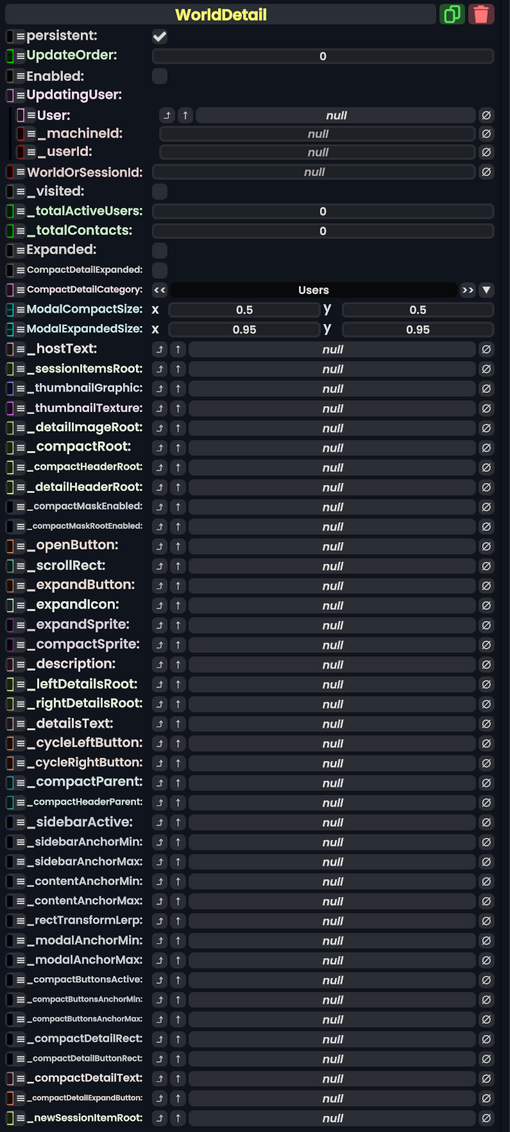
World Detail component as seen in the Scene Inspector

The WorldDetail component is used to display information about a world to a UI.
Usage
| Name | Type | Description |
|---|---|---|
persistent
|
Bool | Determines whether or not this item will be saved to the server. |
UpdateOrder
|
Int | Controls the order in which this component is updated. |
Enabled
|
Bool | Controls whether or not this component is enabled. Some components stop their functionality when this field is disabled, but some don't. |
UpdatingUser
|
direct UserRef | The user managing updates for this component. |
WorldOrSessionId
|
String | The world or session ID to get info on. |
_visited
|
Bool | Whether UpdatingUser has visited this world.
|
_totalActiveUsers
|
Int | How many active ussrs are in the world. |
_totalContacts
|
Int | How many contacts of UpdatingUser are in the world.
|
Expanded
|
Bool | Whether the world item UI has been hovered over in the dash. |
CompactDetailExpanded
|
Bool | Whether the extra detail has been expanded. |
CompactDetailCategory
|
DetailCategory | The detail to show in the compact view. |
ModalCompactSize
|
Float2 | The size of the world item when not hovered over. |
ModalExpandedSize
|
Float2 | The size of the world item when hovered over. |
_hostText
|
Text | The Text Component showing the host name. |
_sessionItemsRoot
|
Slot | The slot containing current sessions of the world. |
_thumbnailGraphic
|
RawGraphic | The UIX graphic showing the thumbnail. |
_thumbnailTexture
|
StaticTexture2D | The texture for the world thumbnail. |
_detailImageRoot
|
Slot | The root slot of the detail image graphic. |
_compactRoot
|
Slot | The root of the graphic when it is not clicked into. |
_compactHeaderRoot
|
Slot | the root of the text graphic of the world item before clicking into it. |
_detailHeaderRoot
|
Slot | the root of the text graphic of the world item after clicking into it. |
_compactMaskEnabled
|
field drive of Bool | The field to drive for whether or not the compact view mask should be enabled. |
_compactMaskRootEnabled
|
field drive of Bool | The field to drive for whether or not the compact mask root slot should be enabled. |
_openButton
|
Button | The button Component for opening the world. |
_scrollRect
|
ScrollRect | The scroll rectangle for the detail menu of the world item. |
_expandButton
|
Button | The button used for showing the un compact view. |
_expandIcon
|
Image | The icon for _expandButton.
|
_expandSprite
|
Sprite | The sprite for _expandButton.
|
_compactSprite
|
Sprite | The sprite for the switch to compact mode. |
_description
|
Text | The text used to show the world description. |
_leftDetailsRoot
|
Slot | the slot used to store the left side details. |
_rightDetailsRoot
|
Slot | the slot used to store the right side details. |
_detailsText
|
Text | The text used to show the world details. |
_cycleLeftButton
|
Button | the button for cycling left. |
_cycleRightButton
|
Button | the button for cycling right. |
_compactParent
|
direct RefDrive`1<Slot> | the parent slot of the compact view graphic. |
_compactHeaderParent
|
direct RefDrive`1<Slot> | the parent slot of the compact views text header. |
_sidebarActive
|
field drive of Bool | The field to drive with whether the sidebar should be active. |
_sidebarAnchorMin
|
field drive of Float2 | The field to drive for the sidebar's rectangle anchor minimum. |
_sidebarAnchorMax
|
field drive of Float2 | The field to drive for the sidebar's rectangle anchor maximum. |
_contentAnchorMin
|
field drive of Float2 | The field to drive for the content's rectangle anchor minimum. |
_contentAnchorMax
|
field drive of Float2 | The field to drive for the content's rectangle anchor maximum. |
_rectTransformLerp
|
field drive of Float | The field to drive for the animation transitions for the item hovering. |
_modalAnchorMin
|
field drive of Float2 | The field to drive for the modal's rectangle anchor minimum. |
_modalAnchorMax
|
field drive of Float2 | The field to drive for the modal's rectangle anchor maximum. |
_compactButtonsActive
|
field drive of Bool | The field to drive for the compact buttons active status. |
_compactButtonsAnchorMin
|
field drive of Float2 | The field to drive for the compact buttons rectangle anchor minimum. |
_compactButtonsAnchorMax
|
field drive of Float2 | The field to drive for the compact buttons rectangle anchor maximum. |
_compactDetailRect
|
field drive of Rect | The field to drive with the current compact details rectangle component. |
_compactDetailButtonRect
|
field drive of Rect | The field to drive with the current compact details button rectangle component. |
_compactDetailText
|
Text | The text field that stores the compact view details. |
_compactDetailExpandButton
|
Button | The button Component that is used to expand the details in the compact view. |
_newSessionItemRoot
|
Slot | The slot for the graphic for making a new session button. |
DetailCategory
| Name | Value | Description |
|---|---|---|
Users
|
0 | Show the users. |
Description
|
1 | Show the description. |
Usage
This article or section is a stub. You can help the Resonite wiki by expanding it.
Examples
Used in the dash previously.