The '''PagingControl''' component allows for counting up a number of items specified, then outputs it to either a [[Component:Text|Text]] or [[Component:TextRenderer|TextRenderer]] component.
<!--T:2-->
<!--T:2-->
== Fields ==
== Fields ==
{{Table ComponentFields
{{Table ComponentFields
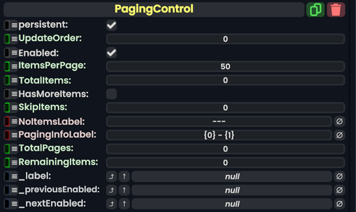
|ItemsPerPage|Int|
|ItemsPerPage|Int| The increment to count up by.
|TotalItems|Int|
|TotalItems|Int| The total amount of items.
|HasMoreItems|Bool|
|HasMoreItems|Bool| Allows to count beyond the max set of items.
|SkipItems|Int|
|SkipItems|Int| Skips items that are listed here.
|NoItemsLabel|String|
|NoItemsLabel|String| Shows the output as this when there are no items.
|PagingInfoLabel|String|
|PagingInfoLabel|String| The structure of how the items will be shown to the user.
|_nextEnabled|{{RootFieldType|FieldDrive`1|[[Type:Bool|Bool]]}}|TypeAdv10=true| Becomes false if the maximum is currently reached.
}}
== Sync Delegates ==
{{Table ComponentTriggers
|NextPage:[[Type:ButtonEventHandler|ButtonEventHandler]]|[[Type:ButtonEventHandler|ButtonEventHandler]]|true| Switches to the next page via button.
|PreviousPage:[[Type:ButtonEventHandler|ButtonEventHandler]]|[[Type:ButtonEventHandler|ButtonEventHandler]]|true|Switches to the previous page via button.
|NextPage:[[Type:Action|Action]]|[[Type:Action|Action]]|false| Switches to the next page via action.
|PreviousPage:[[Type:Action|Action]]|[[Type:Action|Action]]|false|Switches to the previous page via action.
}}
}}
<!--T:3-->
<!--T:3-->
== Usage ==
== Usage ==
Great for counting items, and for controlling UI that can switch pages.