|_detailText|'''[[Component:TextRenderer|TextRenderer]]'''|TypeAdv2=true| The detail text indicator visual used to indicate the current progress details.
|_tint|{{RootFieldType|FieldDrive`1|[[Type:ColorX|ColorX]]}}|TypeAdv4=true| The field to drive with the progress bar tint.
}}
}}
== Behavior ==
== Usage ==
Not used directly by the user. Used in legacy content.
== Examples ==
== Examples ==
Used in legacy content.
== See Also ==
== See Also ==
Line 22:
Line 25:
[[Category:Components:Uncategorized{{#translation:}}|Legacy Segment Circle Progress]]
[[Category:Components:Uncategorized{{#translation:}}|Legacy Segment Circle Progress]]
[[Category:Components{{#translation:}}|Legacy Segment Circle Progress]]
[[Category:Components{{#translation:}}|Legacy Segment Circle Progress]]
[[Category:ComponentStubs]]
Latest revision as of 16:59, 8 April 2025
This article describes a feature marked as legacy—this usually means there's a newer, better alternative. Legacy features might not be removed but they will not be updated, and the team will not provide any support for them.
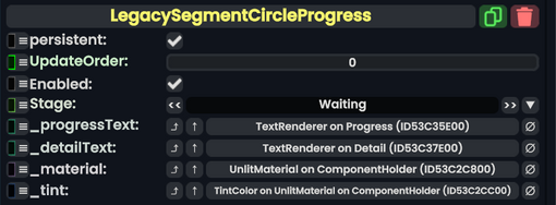
Component image
Legacy Segment Circle Progress component as seen in the Scene Inspector
The LegacySegmentCircleProgress component was used to handle progress bars on arc circles. Was used in loading progress bars.