The '''OutlinedArc''' component takes in many parameters to create a circular image or design and can be controlled using those parameters. Then this renders onto the [[UIX]].
<!--T:3-->
<!--T:3-->
== Usage ==
{{Table ComponentFields
{{Table ComponentFields
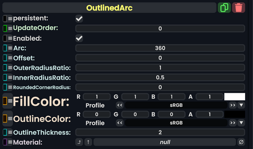
|Arc|Float|
|Arc|Float|The amount to arc around the center.
|Offset|Float|
|Offset|Float|The amount to rotate around the center.
|OuterRadiusRatio|Float|
|OuterRadiusRatio|Float|The outer distance for this arc from the center.
|InnerRadiusRatio|Float|
|InnerRadiusRatio|Float|The inner distance for this arc from the center.
|RoundedCornerRadius|Float|
|RoundedCornerRadius|Float|The amount of how rounded the edges of the arc end points are.
|FillColor|ColorX|
|FillColor|ColorX|The inner color (filled in color) of this arc.
|OutlineColor|ColorX|
|OutlineColor|ColorX|The outer color (the outline) of this arc.
|OutlineThickness|Float|
|OutlineThickness|Float|The amount to thicken for the outline.
The OutlinedArc component takes in many parameters to create a circular image or design and can be controlled using those parameters. Then this renders onto the UIX.