A Button is a [[UIX]] component allows for users to click on its Rect. It provides visual feedback by altering the colors of graphics on the Rect, and is able to trigger several other components, such as [[Component:TextField|Text Field]], by using the [[Button Events]] system.
The '''Button''' component is an interactive [[UIX]] element that allows for users to click on its [[Component:RectTransform|RectTransform]]. It can provide visual feedback by altering the colors of graphics on the RectTransform [[Slot]], such as the [[Component:Image|Image]] component. This is able to trigger several other components, such as [[Component:TextField|Text Field]], by using the [[Button Events]] system.
<!--T:3-->
<!--T:3-->
== Usage ==
{{Table ComponentFields
{{Table ComponentFields
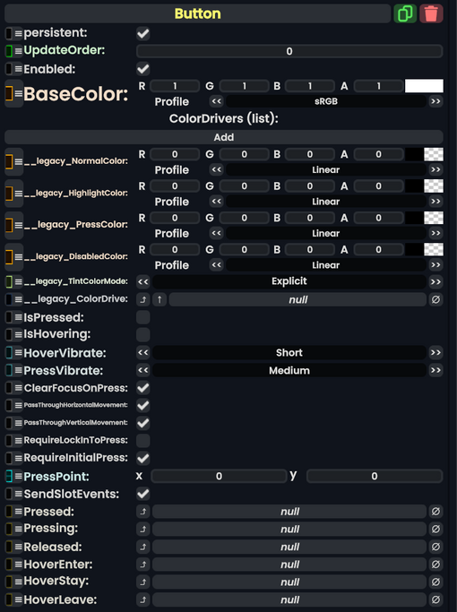
|BaseColor|ColorX|The color that all other tints will be based on
|BaseColor|ColorX|The color that all other tints will be based on
|ColorDrivers|{{RootFieldType|SyncList`1|[[Type:ColorDriver|ColorDriver]]}}|TypeAdv1=true|A list of sets of colors. Each one points at another component's color, and determines how it looks normally, when highlighted, when pressed, and when disabled
|ColorDrivers|{{RootFieldType|SyncList`1|[[Type:ColorDriver|ColorDriver]]}}|TypeAdv1=true|A list of sets of colors. Each one points at another component's color, and determines how it looks normally, when highlighted, when pressed, and when disabled
|__legacy_NormalColor|ColorX|
|__legacy_NormalColor|ColorX|Legacy normal button color.
|__legacy_ColorDrive|{{RootFieldType|FieldDrive`1|[[Type:ColorX|ColorX]]}}|TypeAdv7=true|Legacy color drive button.
|IsPressed|Bool|True if the button is being pressed
|IsPressed|Bool|True if the button is being pressed
|IsHovering|Bool|True if someone is hovering over the button
|IsHovering|Bool|True if someone is hovering over the button
Line 31:
Line 29:
|PassThroughVerticalMovement|Bool|Whether or not press-and-drag movement should be passed to higher components
|PassThroughVerticalMovement|Bool|Whether or not press-and-drag movement should be passed to higher components
(such as [[Scroll Rect (Component)|Scroll Rect]]s)
(such as [[Scroll Rect (Component)|Scroll Rect]]s)
|RequireLockInToPress|Bool|FIXME. Defaults to false.
|RequireLockInToPress|Bool|Internal. Defaults to false.
|RequireInitialPress|Bool|FIXME. Defaults to true.
|RequireInitialPress|Bool|Internal - Check for the initial press of the button. Defaults to true.
|PressPoint|Float2|The (x,y) coordinate where the button is being pressed
|PressPoint|Float2|The (x,y) coordinate where the button is being pressed
|SendSlotEvents|Bool|If set, all Pressing, Pressed, Released, HoverEnter, HoverStay, and HoverLeave events are sent to all [[IButtonPressReceiver]] components within this component's slot. Defaults to true.
|SendSlotEvents|Bool|If set, all Pressing, Pressed, Released, HoverEnter, HoverStay, and HoverLeave events are sent to all [[IButtonPressReceiver]] components within this component's slot. Defaults to true.
Line 43:
Line 41:
}}
}}
== Behavior ==
== Usage ==
This can be used with [[ProtoFlux]], and specifically the [[ProtoFlux:Button Events|Button Events]] node. Allowing it to fire [[Impulses]] from this [[Type:IButton|IButton]] reference.
The Button component is an interactive UIX element that allows for users to click on its RectTransform. It can provide visual feedback by altering the colors of graphics on the RectTransform Slot, such as the Image component. This is able to trigger several other components, such as Text Field, by using the Button Events system.
A list of sets of colors. Each one points at another component's color, and determines how it looks normally, when highlighted, when pressed, and when disabled
If set, all Pressing, Pressed, Released, HoverEnter, HoverStay, and HoverLeave events are sent to all IButtonPressReceiver components within this component's slot. Defaults to true.