Component:ArcLayout: Difference between revisions
From Resonite Wiki
More actions
Cleanup. Added field descriptions. added a link to a related component. |
Fixed links. |
||
| Line 28: | Line 28: | ||
== Related Components == | == Related Components == | ||
* [[Component:ArcSegmentLayout|ArcSegmentLayout]] | * [[Component:ArcSegmentLayout|ArcSegmentLayout]] | ||
* [[Component:OutlinedArc{{#translation:}}|OutlinedArc]] | |||
</translate> | </translate> | ||
Revision as of 10:27, 28 July 2024
Component image 
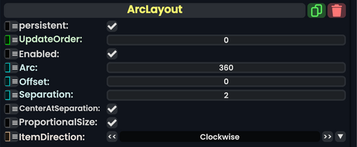
ArcLayout component as seen in the Scene Inspector

The ArcLayout is a component primarily used in a user's context menu. It requires a set of slots under the slot the component is attached to, and each slot needs an OutlinedArc Component and an ArcSegmentLayout Component.
| Name | Type | Description |
|---|---|---|
persistent
|
Bool | Determines whether or not this item will be saved to the server. |
UpdateOrder
|
Int | Controls the order in which this component is updated. |
Enabled
|
Bool | Controls whether or not this component is enabled. Some components stop their functionality when this field is disabled, but some don't. |
Arc
|
Float | The amount of the circle in degrees to cover with the arc elements. |
Offset
|
Float | the amount to rotate the arc elements around the center in degrees from the default position. |
Separation
|
Float | how much to separate the elements from each other. |
CenterAtSeparation
|
Bool | Centers the separation point of this layout. |
ProportionalSize
|
Bool | Keep all segments of the arc proportional in size. |
ItemDirection
|
Direction | How to arrange the elements in order from the initial position. |