Component:PagingControl: Difference between revisions
From Resonite Wiki
More actions
Automated: update component fields |
This is no longer a stub. Added a description, added field descriptions, added usage description. |
||
| Line 2: | Line 2: | ||
<translate> | <translate> | ||
<!--T:1--> | <!--T:1--> | ||
{{Infobox Component | {{Infobox Component | ||
|Image=PagingControlComponent.png | |Image=PagingControlComponent.png | ||
|Name=Paging Control | |Name=Paging Control | ||
}} | }} | ||
The '''PagingControl''' component allows for counting up a number of items specified, then outputs it to either a [[Component:Text|Text]] or [[Component:TextRenderer|TextRenderer]] component. | |||
<!--T:2--> | <!--T:2--> | ||
== Fields == | == Fields == | ||
{{Table ComponentFields | {{Table ComponentFields | ||
|ItemsPerPage|Int| | |ItemsPerPage|Int| The increment to count up by. | ||
|TotalItems|Int| | |TotalItems|Int| The total amount of items. | ||
|HasMoreItems|Bool| | |HasMoreItems|Bool| Allows to count beyond the max set of items. | ||
|SkipItems|Int| | |SkipItems|Int| Skips items that are listed here. | ||
|NoItemsLabel|String| | |NoItemsLabel|String| Shows the output as this when there are no items. | ||
|PagingInfoLabel|String| | |PagingInfoLabel|String| The structure of how the items will be shown to the user. | ||
|TotalPages|{{RootFieldType|RawOutput`1|[[Type:Int|Int]]}}|TypeAdv6=true| | |TotalPages|{{RootFieldType|RawOutput`1|[[Type:Int|Int]]}}|TypeAdv6=true| The total amount of items. | ||
|RemainingItems|{{RootFieldType|RawOutput`1|[[Type:Int|Int]]}}|TypeAdv7=true| | |RemainingItems|{{RootFieldType|RawOutput`1|[[Type:Int|Int]]}}|TypeAdv7=true| Shows how many items are remaining. | ||
|_label|{{RootFieldType|FieldDrive`1|[[Type:String|String]]}}|TypeAdv8=true| | |_label|{{RootFieldType|FieldDrive`1|[[Type:String|String]]}}|TypeAdv8=true| The text to output. | ||
|_previousEnabled|{{RootFieldType|FieldDrive`1|[[Type:Bool|Bool]]}}|TypeAdv9=true| | |_previousEnabled|{{RootFieldType|FieldDrive`1|[[Type:Bool|Bool]]}}|TypeAdv9=true| Becomes false if the minimum is currently reached. | ||
|_nextEnabled|{{RootFieldType|FieldDrive`1|[[Type:Bool|Bool]]}}|TypeAdv10=true| | |_nextEnabled|{{RootFieldType|FieldDrive`1|[[Type:Bool|Bool]]}}|TypeAdv10=true| Becomes false if the maximum is currently reached. | ||
}} | }} | ||
<!--T:3--> | <!--T:3--> | ||
== Usage == | == Usage == | ||
Great for counting items. | |||
<!--T:4--> | <!--T:4--> | ||
| Line 33: | Line 35: | ||
== Related Components == | == Related Components == | ||
</translate> | </translate> | ||
[[Category:Components{{#translation:}}|Paging Control]] | [[Category:Components{{#translation:}}|Paging Control]] | ||
[[Category:Components:Common UI:General{{#translation:}}|Paging Control]] | [[Category:Components:Common UI:General{{#translation:}}|Paging Control]] | ||
Revision as of 01:15, 13 September 2024
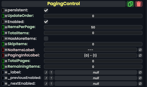
Component image 
Paging Control component as seen in the Scene Inspector

The PagingControl component allows for counting up a number of items specified, then outputs it to either a Text or TextRenderer component.
Fields
| Name | Type | Description |
|---|---|---|
persistent
|
Bool | Determines whether or not this item will be saved to the server. |
UpdateOrder
|
Int | Controls the order in which this component is updated. |
Enabled
|
Bool | Controls whether or not this component is enabled. Some components stop their functionality when this field is disabled, but some don't. |
ItemsPerPage
|
Int | The increment to count up by. |
TotalItems
|
Int | The total amount of items. |
HasMoreItems
|
Bool | Allows to count beyond the max set of items. |
SkipItems
|
Int | Skips items that are listed here. |
NoItemsLabel
|
String | Shows the output as this when there are no items. |
PagingInfoLabel
|
String | The structure of how the items will be shown to the user. |
TotalPages
|
raw output of Int | The total amount of items. |
RemainingItems
|
raw output of Int | Shows how many items are remaining. |
_label
|
field drive of String | The text to output. |
_previousEnabled
|
field drive of Bool | Becomes false if the minimum is currently reached. |
_nextEnabled
|
field drive of Bool | Becomes false if the maximum is currently reached. |
Usage
Great for counting items.