Component:InventoryItemUI: Difference between revisions
From Resonite Wiki
More actions
Automated: update Fields |
add info |
||
| Line 3: | Line 3: | ||
|Name=Inventory Item UI | |Name=Inventory Item UI | ||
}} | }} | ||
The '''InventoryItemUI''' component is used to represent an item or folder in the [[Inventory]]. | |||
== | == Fields == | ||
{{Table ComponentFields | {{Table ComponentFields | ||
|Browser|{{RootFieldType|RelayRef`1|[[Type:BrowserDialog|BrowserDialog]]}}|TypeAdv0=true| | |Browser|{{RootFieldType|RelayRef`1|[[Type:BrowserDialog|BrowserDialog]]}}|TypeAdv0=true| The browser this belongs too. | ||
|SelectedColor|ColorX| | |SelectedColor|ColorX| The color of this item when selected. | ||
|SelectedText|ColorX| | |SelectedText|ColorX| The text of this item when selected. | ||
|NormalColor|ColorX| | |NormalColor|ColorX| The color of this item when not selected. | ||
|NormalText|ColorX| | |NormalText|ColorX| The text of this item when not selected. | ||
}} | }} | ||
== | == Usage == | ||
Not used by the user. | |||
== Examples == | == Examples == | ||
Makes up the [[Inventory]] UI. | |||
== See Also == | == See Also == | ||
* [[Inventory]] | |||
[[Category:Components:Uncategorized{{#translation:}}|Inventory Item UI]] | [[Category:Components:Uncategorized{{#translation:}}|Inventory Item UI]] | ||
[[Category:Components{{#translation:}}|Inventory Item UI]] | [[Category:Components{{#translation:}}|Inventory Item UI]] | ||
Latest revision as of 18:32, 6 April 2025
Component image 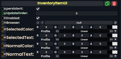
Inventory Item UI component as seen in the Scene Inspector

The InventoryItemUI component is used to represent an item or folder in the Inventory.
Fields
| Name | Type | Description |
|---|---|---|
persistent
|
Bool | Determines whether or not this item will be saved to the server. |
UpdateOrder
|
Int | Controls the order in which this component is updated. |
Enabled
|
Bool | Controls whether or not this component is enabled. Some components stop their functionality when this field is disabled, but some don't. |
Browser
|
direct RelayRef`1<BrowserDialog> | The browser this belongs too. |
SelectedColor
|
ColorX | The color of this item when selected. |
SelectedText
|
ColorX | The text of this item when selected. |
NormalColor
|
ColorX | The color of this item when not selected. |
NormalText
|
ColorX | The text of this item when not selected. |
Usage
Not used by the user.
Examples
Makes up the Inventory UI.