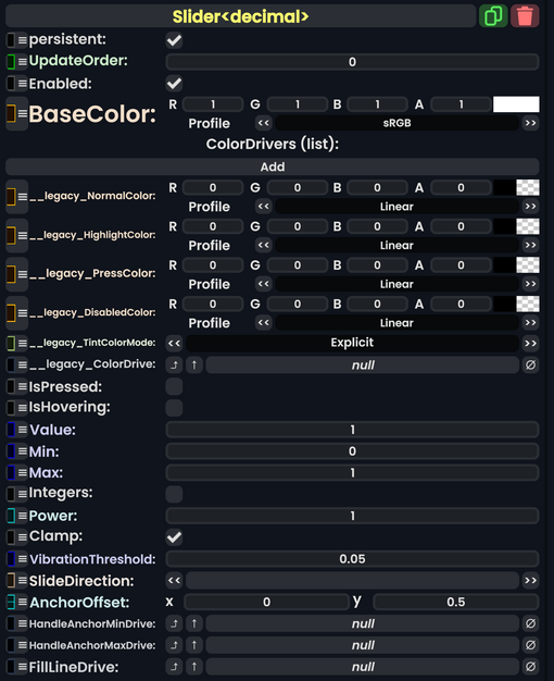
Component:Slider`1
From Resonite Wiki
More actions
Component image 
Slider`1 component as seen in the Scene Inspector

The Slider component is a UIX element that a user can use to grab and move along a line, returning a value of that slider's position.
| Name | Type | Description |
|---|---|---|
persistent
|
Bool | Determines whether or not this item will be saved to the server. |
UpdateOrder
|
Int | Controls the order in which this component is updated. |
Enabled
|
Bool | Controls whether or not this component is enabled. Some components stop their functionality when this field is disabled, but some don't. |
BaseColor
|
ColorX | The color for this slider. |
ColorDrivers
|
list of ColorDriver | Gives extra color control for different color drive targets. |
__legacy_NormalColor
|
ColorX | Internal - Legacy normal color. |
__legacy_HighlightColor
|
ColorX | Internal - Legacy highlight color. |
__legacy_PressColor
|
ColorX | Internal - Legacy press color. |
__legacy_DisabledColor
|
ColorX | Internal - Legacy disabled color. |
__legacy_TintColorMode
|
ColorMode | Internal - Legacy tint color mode. |
__legacy_ColorDrive
|
field drive of ColorX | Internal - Legacy color drive. |
IsPressed
|
Bool | Check if the user is pressing on the slider handle. |
IsHovering
|
Bool | Check if the user is hovering on the slider handle. |
Value
|
T | The position this slider is at (normalized between 0 and 1)
|
Min
|
T | The minimum value of this slider. |
Max
|
T | The maximum value of this slider. |
Integers
|
Bool | Changes the way this slider counts along the slider line. Setting to integers makes it step along whole numbers. |
Power
|
Float | Changes the way this slider determines its position. Power represents a shifted curve of values that is heavier at the ends of the slider. |
Clamp
|
Bool | Enforces the min and max values of this slider. |
VibrationThreshold
|
T | Haptic feedback for this slider. |
SlideDirection
|
Direction<T> | The orientation of this slider's direction. |
AnchorOffset
|
Float2 | The offset for the handle of this slider. |
HandleAnchorMinDrive
|
field drive of Float2 | The min offset for the handle drive. |
HandleAnchorMaxDrive
|
field drive of Float2 | The man offset for the handle drive. |
FillLineDrive
|
field drive of Float2 | Fill line for this slider, fills in one side of it. |
RequireLockInToInteract
|
bool | Checks to see if a user has locked in a press on this slider. |
RequireInitialPress
|
bool | Check for a initial press from a user. |
Usage
Sliders are very useful for making menus that do not need to be precise on UIX elements (unless using steps to lock into a value).
Examples
Videos
ProbablePrime has made a tutorial on sliders for UIX: