This article or section is a stub. You can help the Resonite wiki by expanding it.
Component image 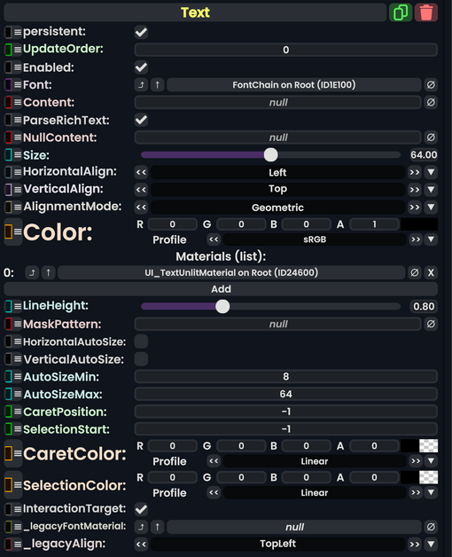
Text component as seen in the Scene Inspector

Introduction
This component displays text inside of a UIX canvas. It also supports text formatting.
Usage
| Name | Type | Description |
|---|---|---|
persistent
|
Bool | Determines whether or not this item will be saved to the server. |
UpdateOrder
|
Int | Controls the order in which this component is updated. |
Enabled
|
Bool | Controls whether or not this component is enabled. Some components stop their functionality when this field is disabled, but some don't. |
Font
|
FontSet | The font to use |
Content
|
String | What to display |
ParseRichText
|
Bool | Whether or not to interpret text formatting |
NullContent
|
String | What to display if Content is empty |
Size
|
Float | The size to render text at, in display units |
HorizontalAlign
|
TextHorizontalAlignment | How to align the text, horizontally |
VerticalAlign
|
TextVerticalAlignment | How to align the text, vertically |
AlignmentMode
|
AlignmentMode | How to compute alignment |
Color
|
ColorX | The color to render the text with |
Materials
|
list of Material | The Material(s) to render with |
LineHeight
|
Float | How high each line of text is |
MaskPattern
|
String | TBD |
HorizontalAutoSize
|
Bool | Automatically adjusts the text's size to fit in its horizontal space |
VerticalAutoSize
|
Bool | Automatically adjusts the text's size to fit in its vertical space |
AutoSizeMin
|
Float | The minimum size that can be reached via auto-sizing |
AutoSizeMax
|
Float | The maximum size that can be reached via auto-sizing |
CaretPosition
|
Int | TBD |
SelectionStart
|
Int | TBD |
CaretColor
|
ColorX | TBD |
SelectionColor
|
ColorX | TBD |
InteractionTarget
|
Bool | TBD |
_legacyFontMaterial
|
FontMaterial | Internal |
_legacyAlign
|
Alignment | Internal |
Examples
Here we start with a parent that has a VerticalLayout component with ForceExpandWidth and ForceExpandHeight set.

The first child contains text, with no LayoutElement.

The second child is an Image with a LayoutElement set to its defaults.

As we see, rather than having equally-weighted children, the image child is squashed. In part this is because the image child has no preferred height, but also the text seems to have a preferred height that includes some empty space underneath it.
Setting various values in the LayoutElement of the image child does expand that child. For example, setting its FlexibleHeight to 1 or its PreferredHeight to 100.